problem
no real issues
So this one didn’t really start with a ‘problem.’ It was more, you could say, exploratory. We were assigned to pick a current application and add our own additional feature to it – something that would elevate it even more. I don’t know why, but for some reason I was drawn to a music platform. Not because music apps have problems, but because they have so much room to grow.
Because music can mean so many things at once. It can remind us of:
People
Places
Feelings
Users can be seen searching for playlists that remind them of someone, some place, or some emotion.
research
nostalgia on everyone’s mind
Keeping these thoughts in mind, I began my research phase. However, because I did not know the exact problem or the exact solution yet, the tone of my questions was deliberately loose. I kept the conversation very open ended, asking users about their relationship with music and how it played into their routine.
Interestingly, not once did I mention the word nostalgia in any of my questions. Yet, it kept coming up in peoples’ answers.



Some questions that were included in interviews.
Music and nostalgia, it turned out, were nearly inseparable.
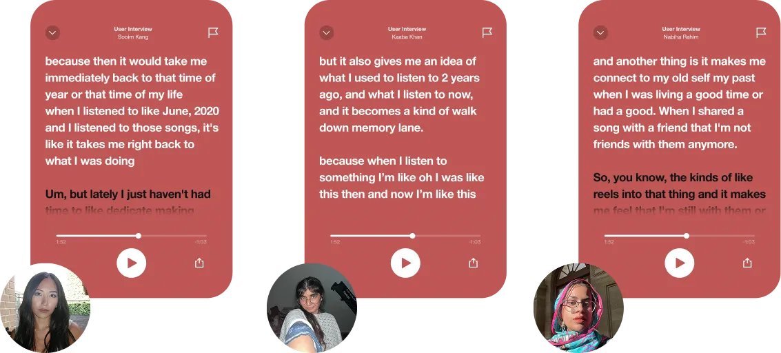
When asked on how she categorizes her music, Sooim, 24, discusses making monthly playlists, just so she could revisit that time in her life over and over again.
When asked how she navigates her listening experience, Kaaba, 22, speaks on Spotify’s ‘liked’ songs, and how, the longer you scroll, the quicker they become a walk down memory lane.
When asked why she likes music, Nabiha, 23, talks about how it connects her with her past selves.
After 6 interviews with avid music listeners, it was clear that there was an unspoken connection between music and memory.
And yet, the platform had no way of honouring it.
As usual, what you’re seeing here is only a fraction of the work that went into this insight.
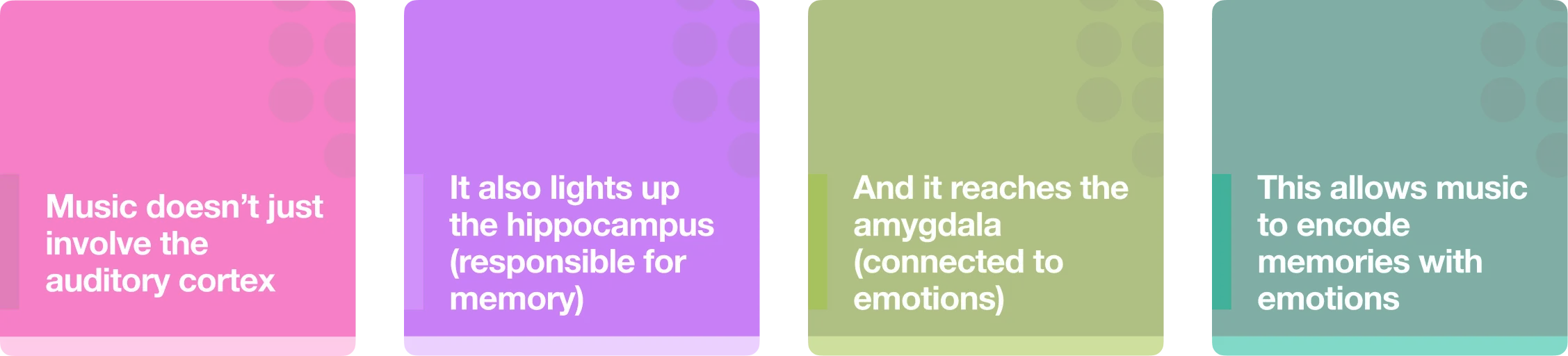
Upon further research, the music-memory link wasn’t just anecdotal – it was backed by science.
design
I started by sketching memories
Finally, the good stuff.
Putting pencil to paper, I began to sketch the ways in which memory could be presented with music.
Concept sketches
Some interesting visualizations came forth.
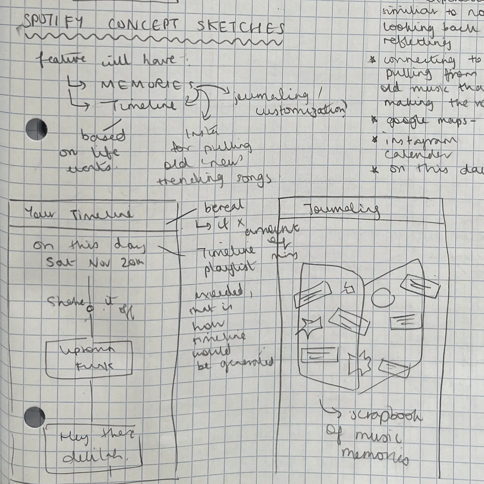
Something I initially came up with was a journal of sorts. During my interviews individuals had told me about how they would use journal entries as a way to record their memories, making their journals the central artifacts in their memory-making. What if elements of the listening experience could be recorded in the same way?
Another idea I had was inspired by the current use of memory in the iPhone photos app. On this day keeps track of photos by date and location, allowing users to see a ‘replay’ of their memories on that day. Could music be collected based on date and location too?
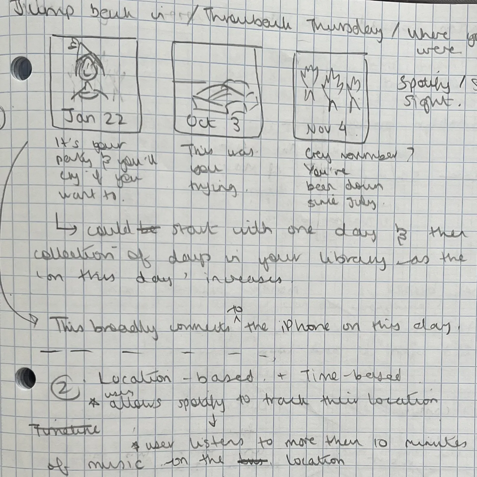

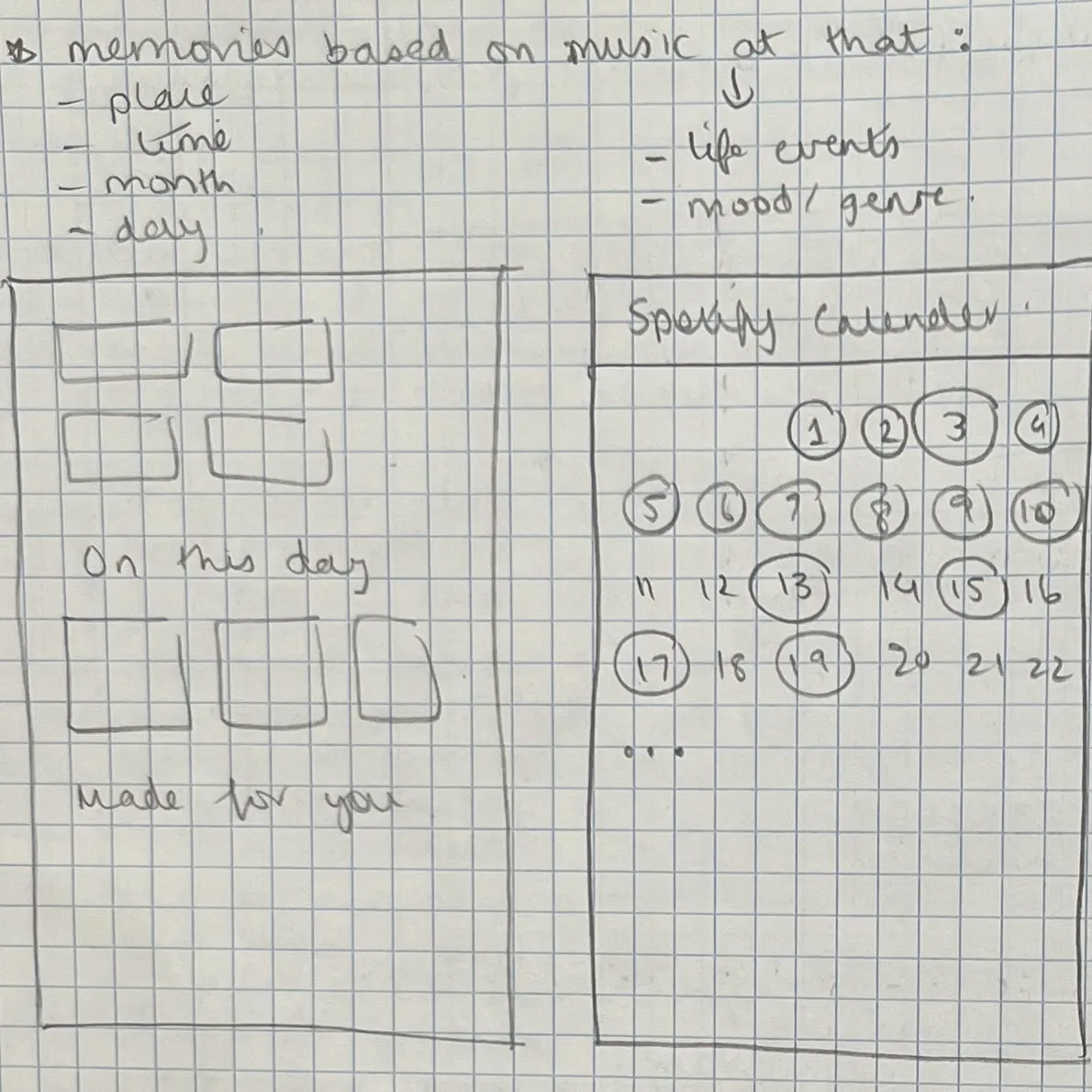
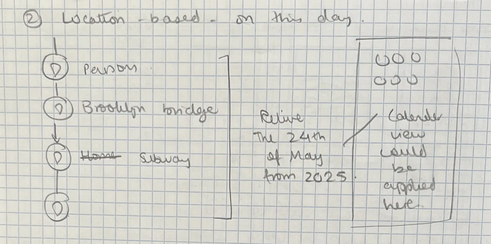
Lastly, because I was also itching to create something that played in a chronological order, I started sketching out timelines. Playlists but maybe in a literal step by step format. Making users feel like they really were going on a journey somewhere.
I was also playing around with calendars and dates here because time needed to be shown in relation to music somehow.
design
functionality – finalizing our concept
Next, it was time to move from paper to prototype.
I took each sketched idea forward and turned it into something you could actually click through. Once the prototypes were ready, usability testing followed. People had a lot of opinions.
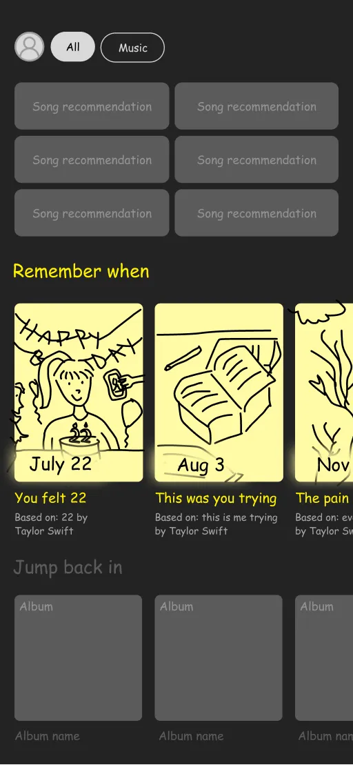
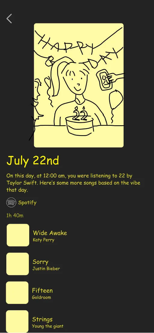
Low-fi 1 – Remember when
This prototype was based on the iPhone’s On this day. Within the homepage, a new tab would appear titled Remember when. I imagined this to be a series of playlists, each inspired by a significant moment in the user’s life. This data would be gathered using realtime tracking of that person’s location and listening activity on Spotify.
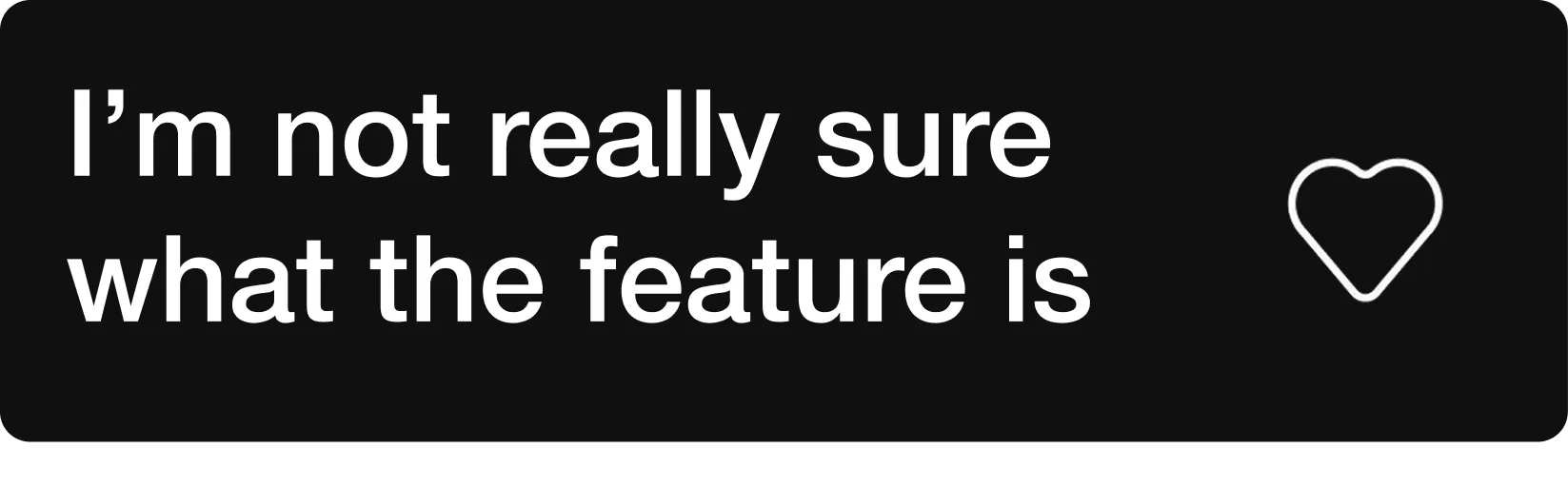
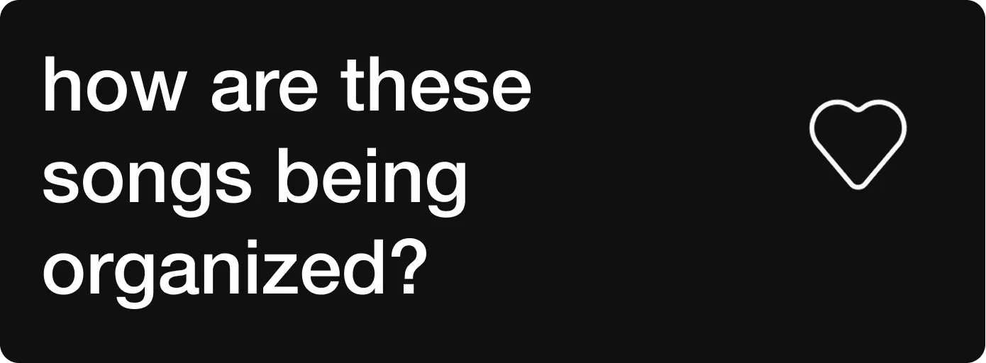
Feedback on this one was mostly negative – the interface did not make clear to users how the songs were organized, nor did it indicate if these were Spotify’s own recommendations or past listens.
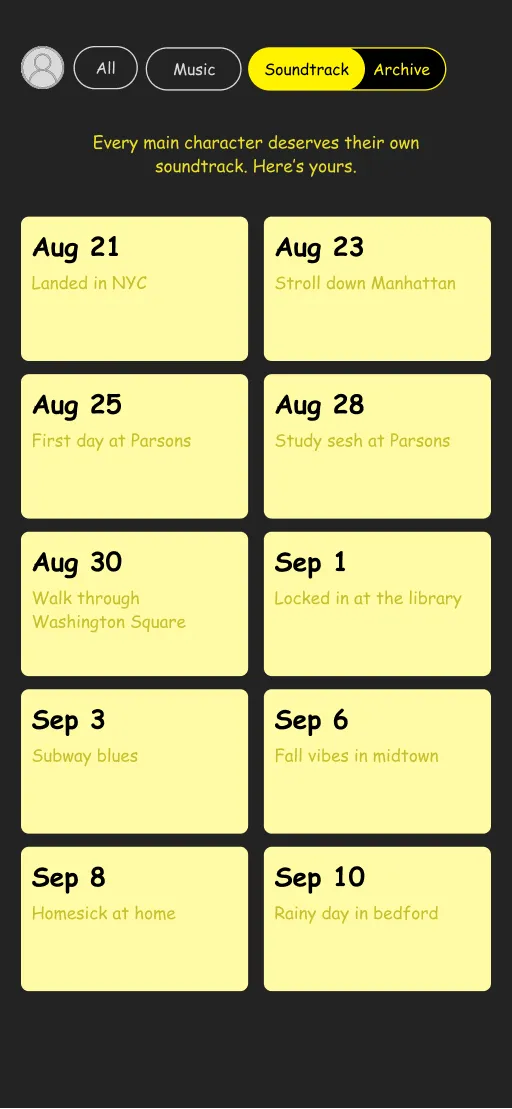
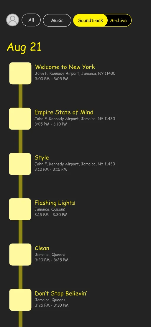
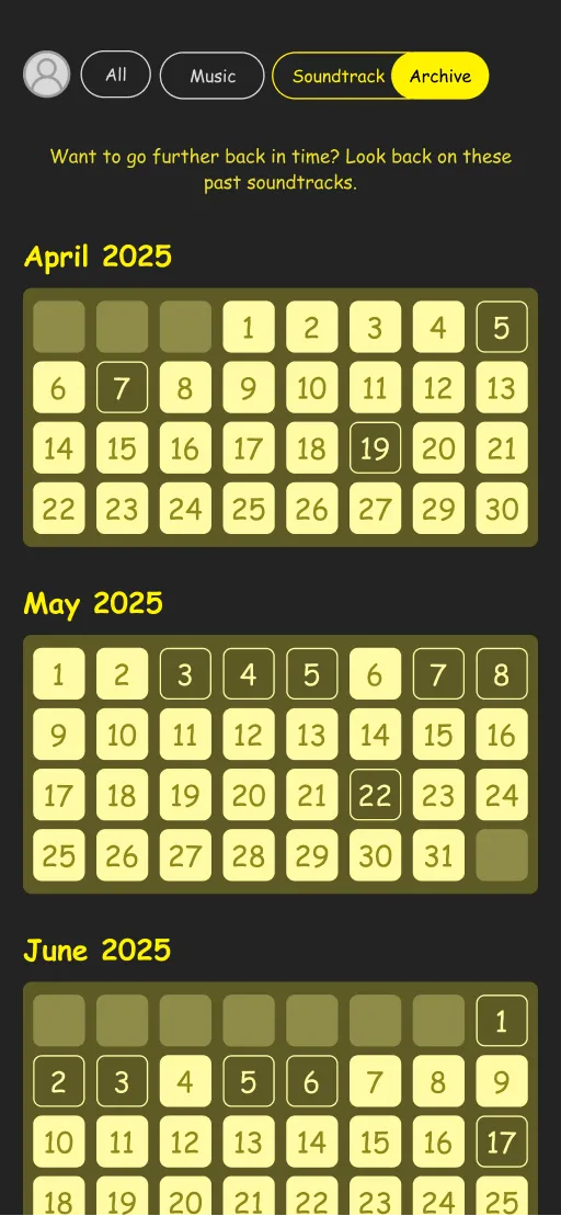
Low-fi 2 – calendar and location
This one catered to the timeline imagery I kept coming back to. Instead of living on the homepage, this feature had its own tab which, when opened, revealed a series of selected days. Users could then access their listening order from that day and play it back chronologically. I also created an Archive section – a full calendar showing days of high listening activity, and days of none.
Feedback on this prototype was generally positive. Users saw this as something they would actually use and had a want for. They also felt this feature was in line with Spotify’s current storytelling.
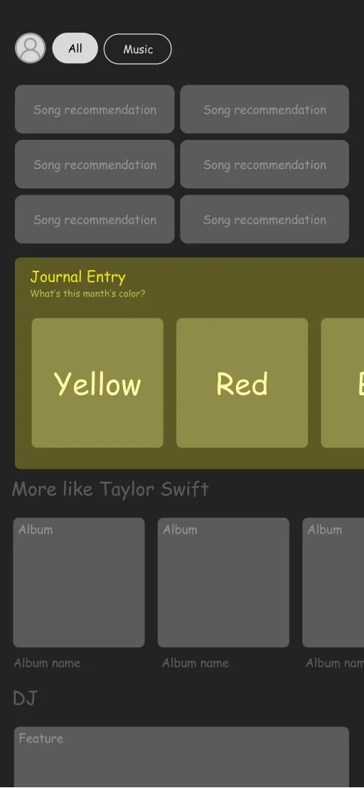
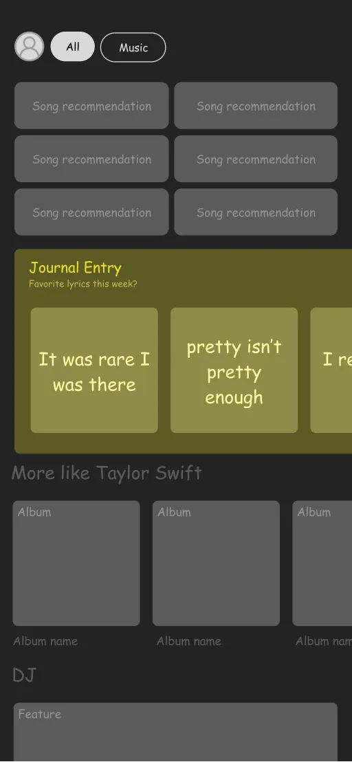
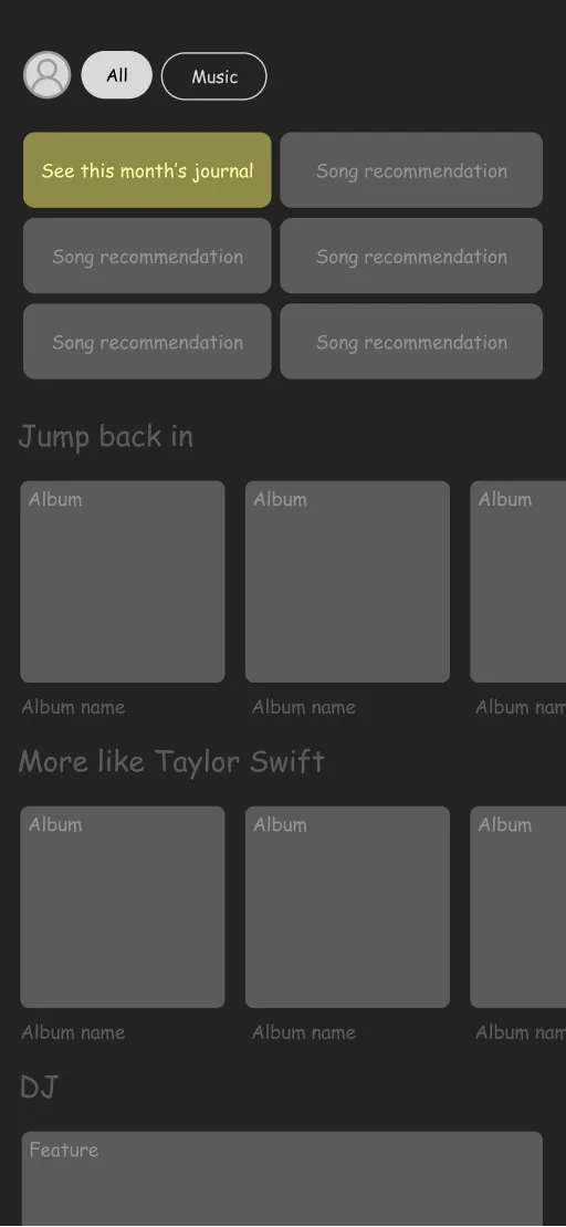
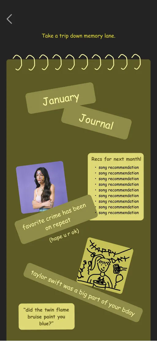
Low-fi 3 – journal entries
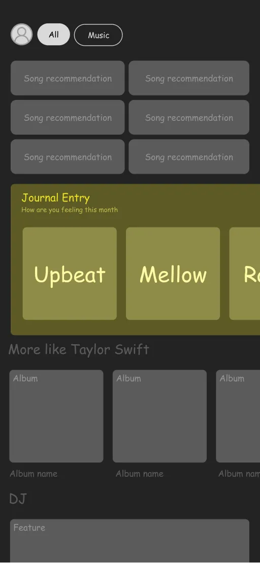
This last prototype pointed to the journal idea. In a more interactive twist, this feature would first allow users to input random things about their listening experience of that month – favourite lyrics, emotions, and so on. At the end of that month, they could then access a journal-like visual which combined all those inputs with some more stats.
This feature had mixed reviews. While many loved the unique visual identity, they could not see it in line with Spotify’s current branding. Many also questioned how this was different from Wrapped.
design
branding – adding emotion
With prototype 2 feeling like a clear winner, the focus shifted to color and emotion. To begin, I did a quick audit of Spotify’s current brand guidelines. Nothing could have prepared me for what I found next.
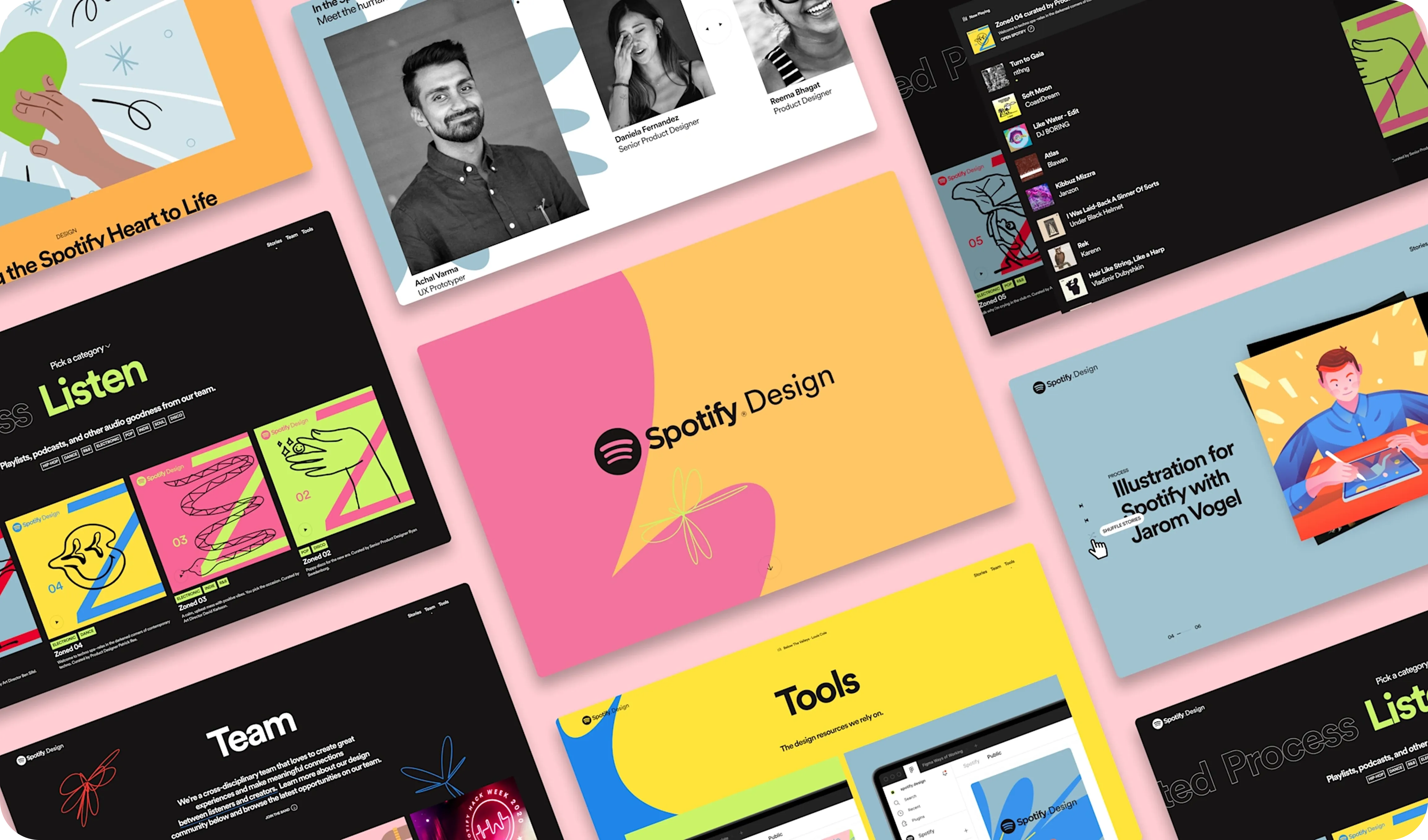
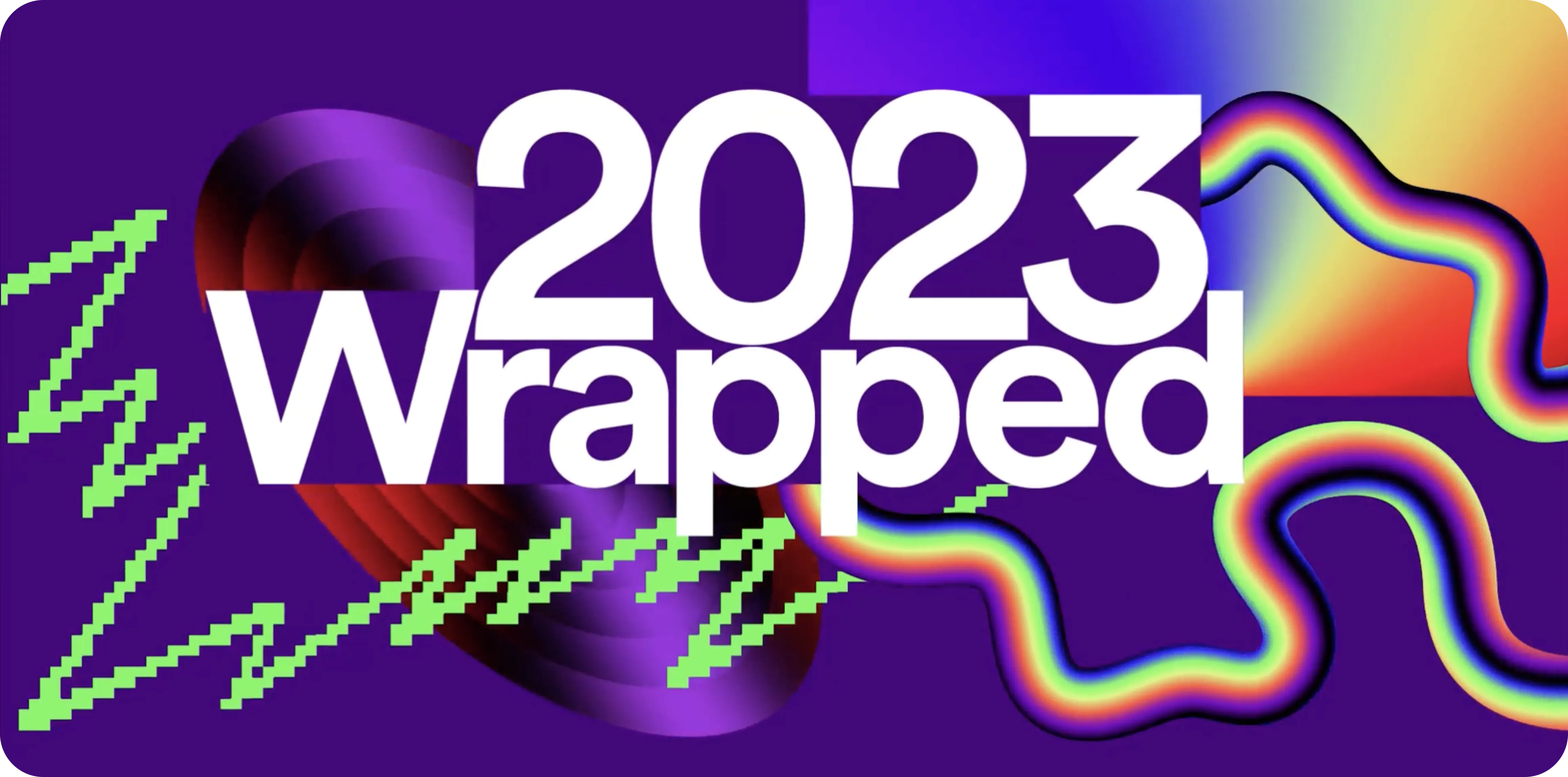
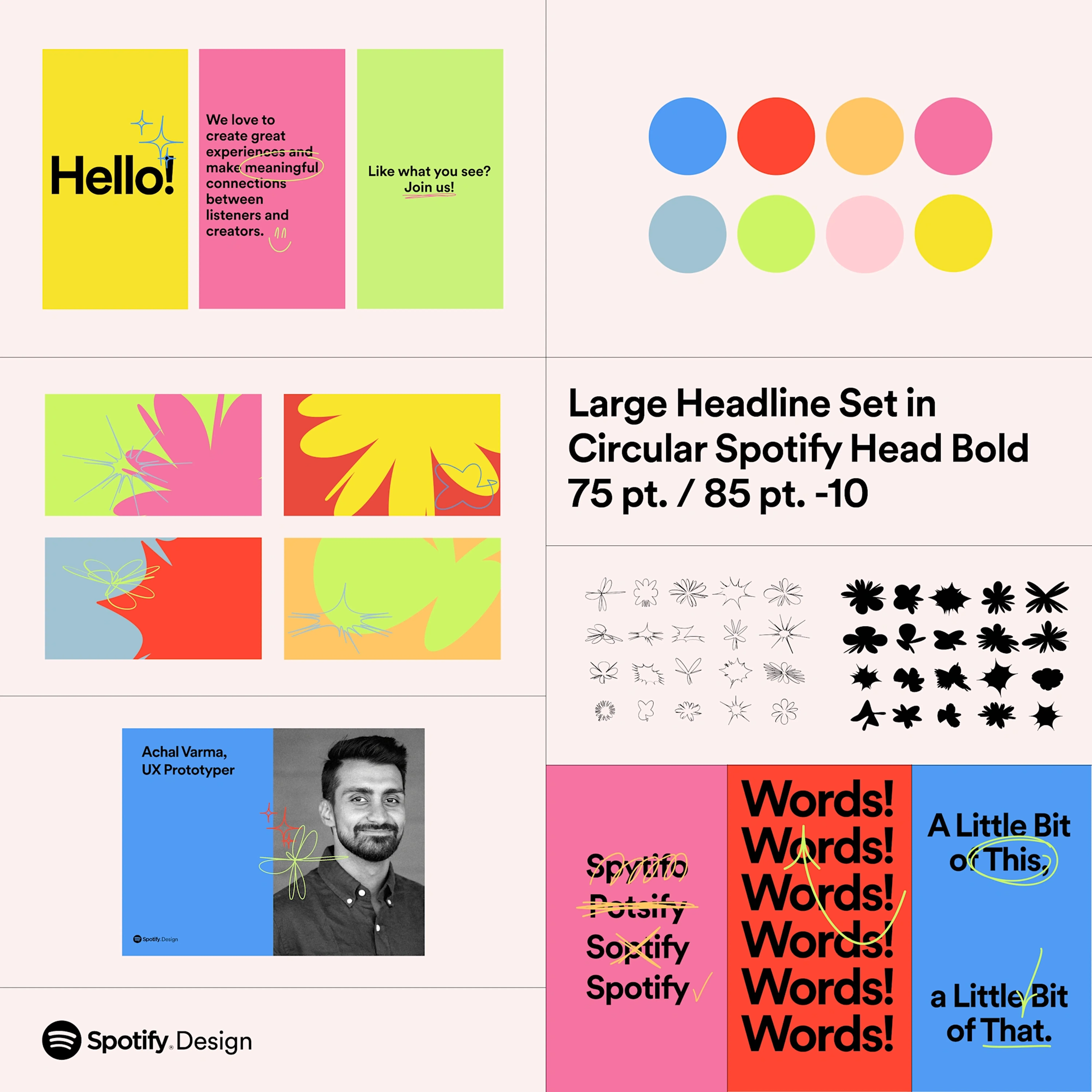
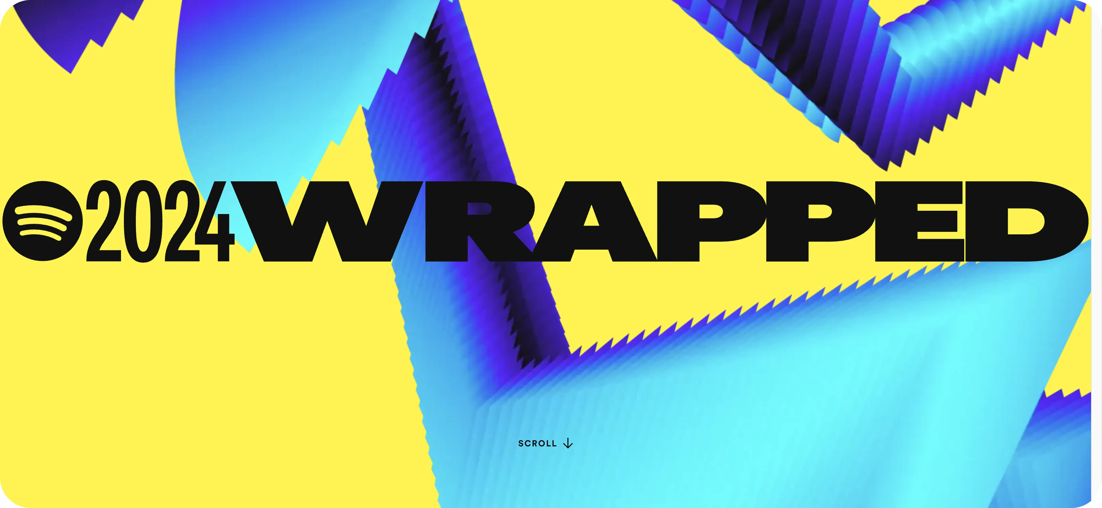
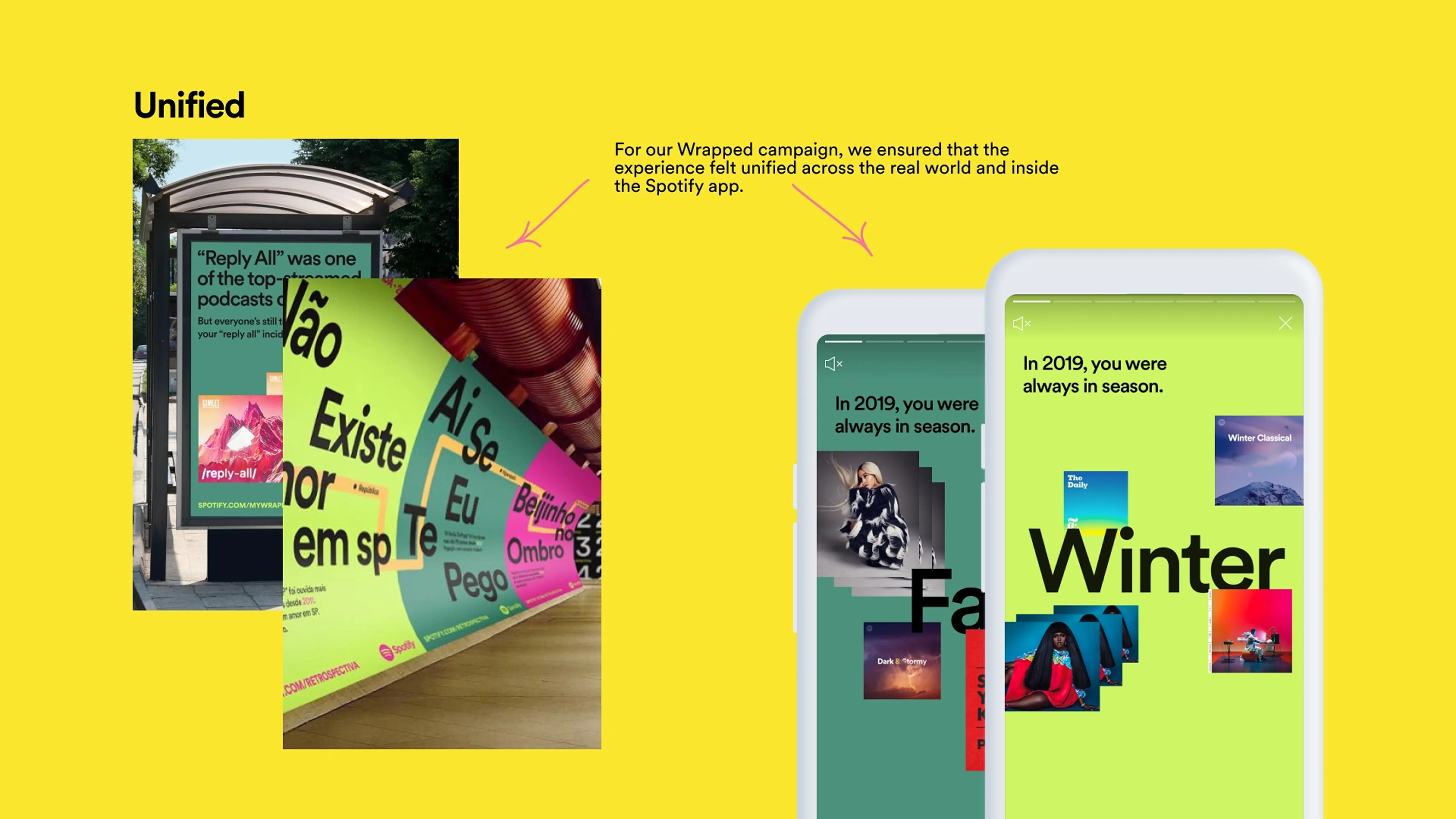
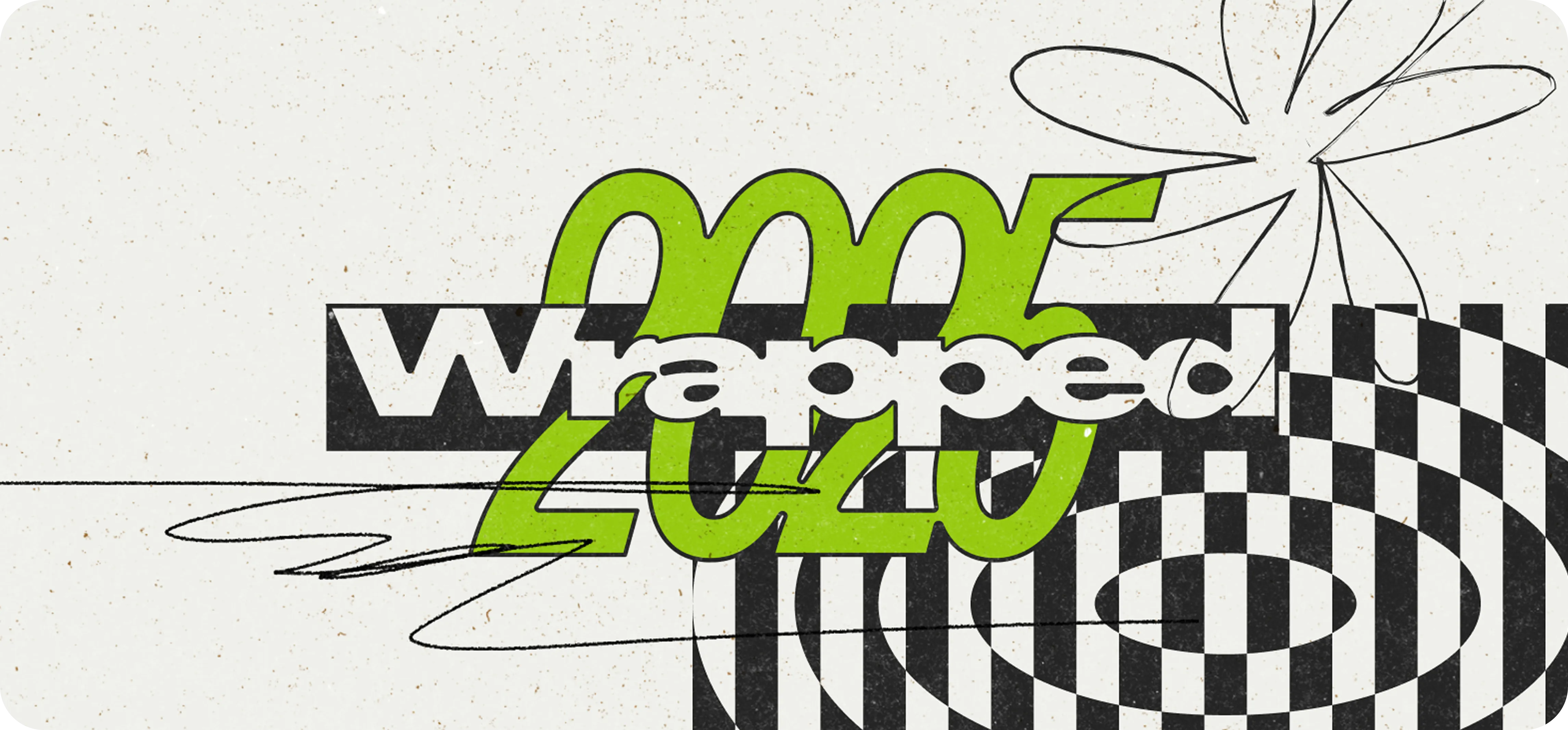
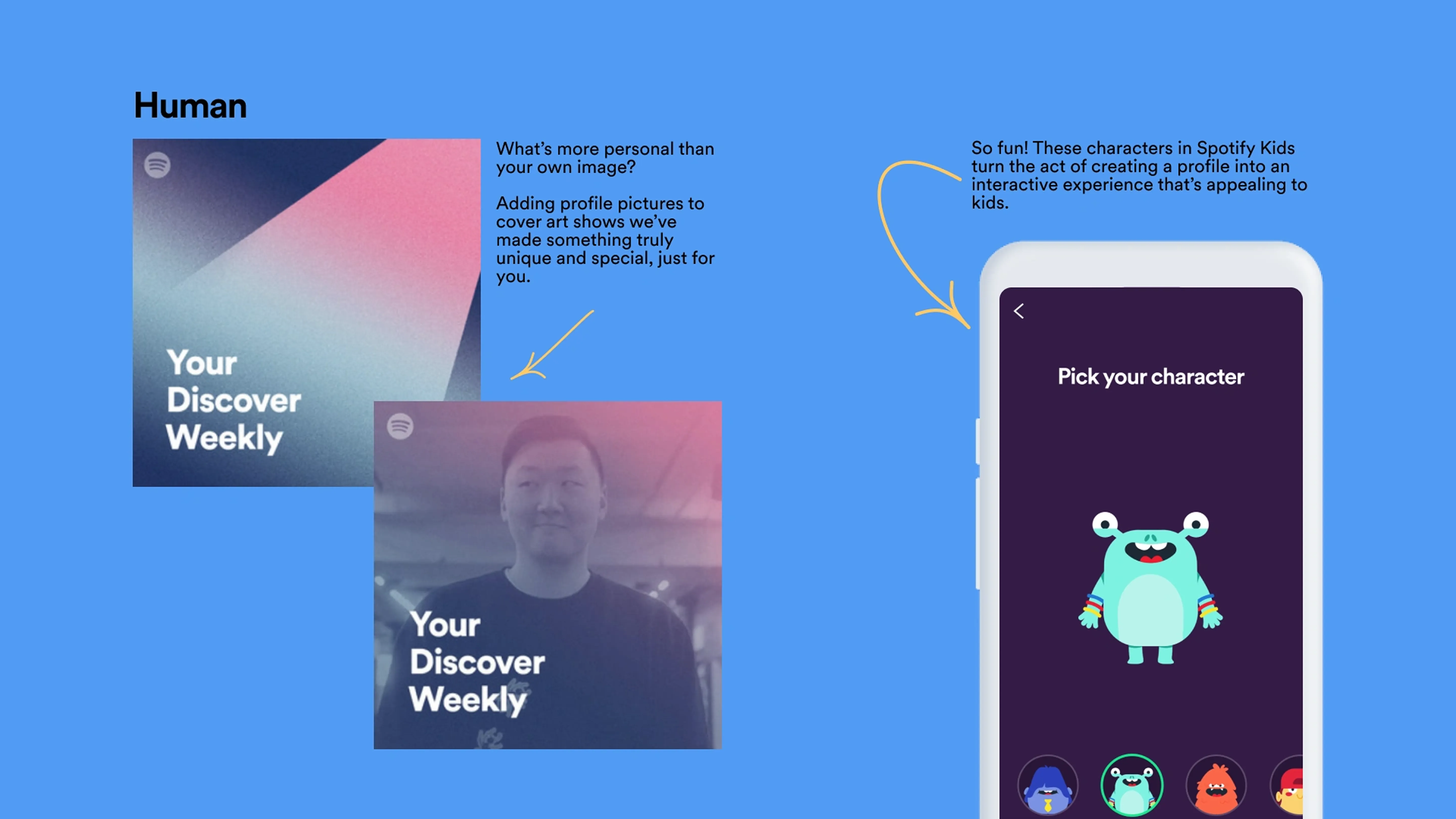
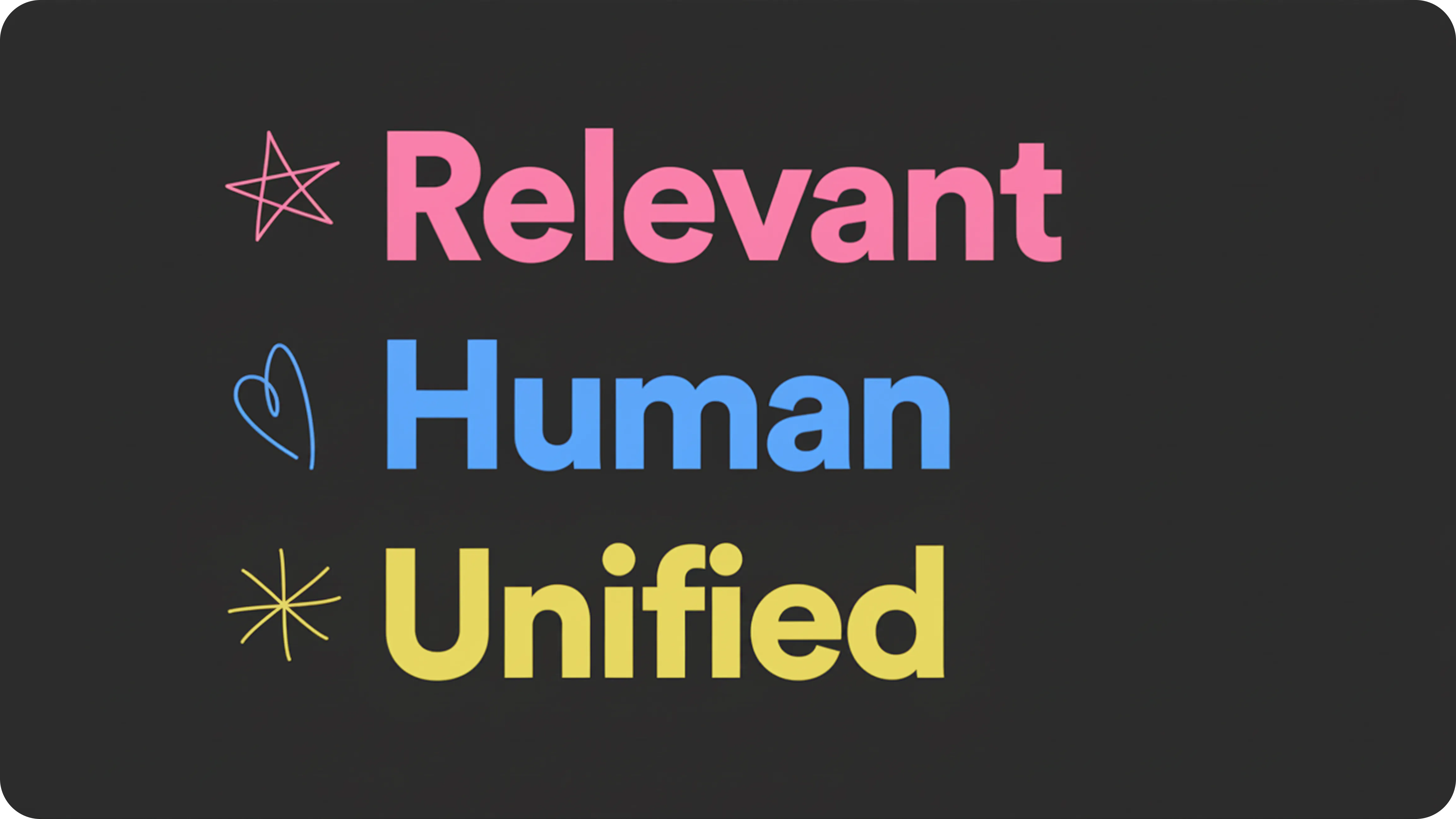
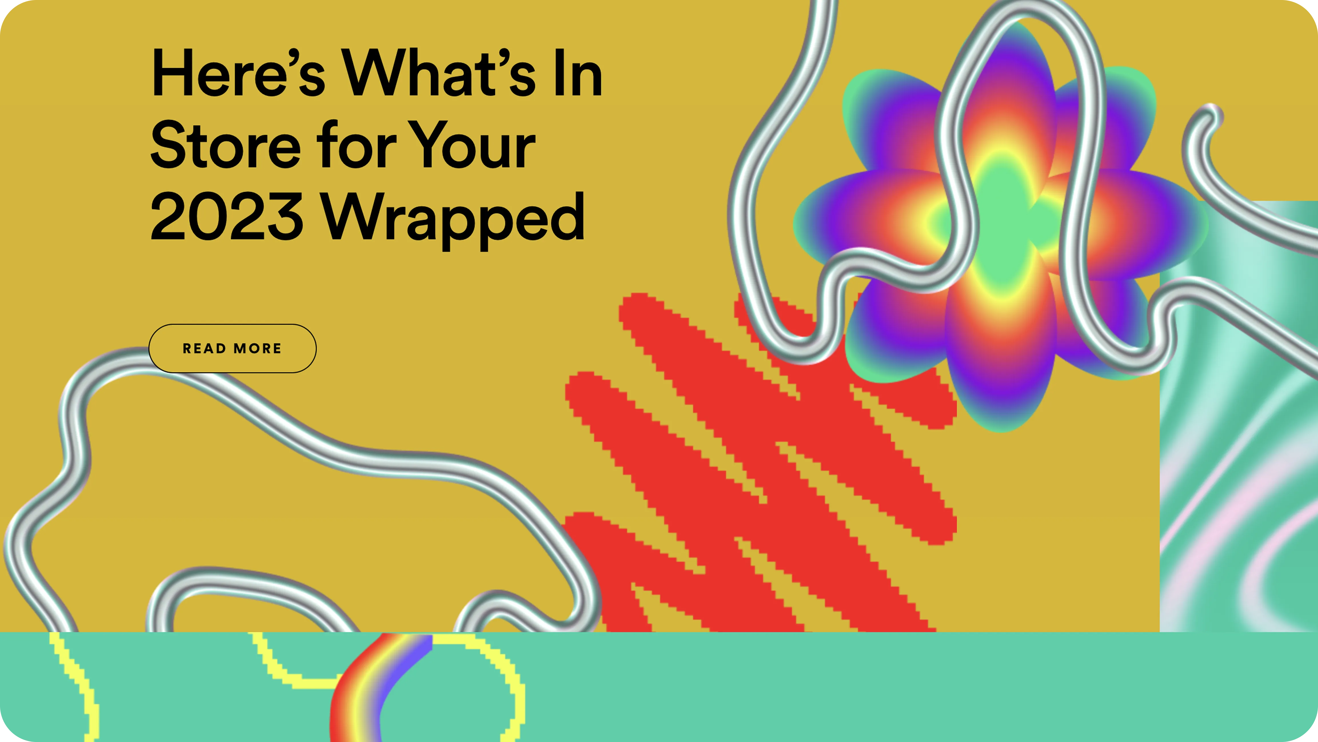
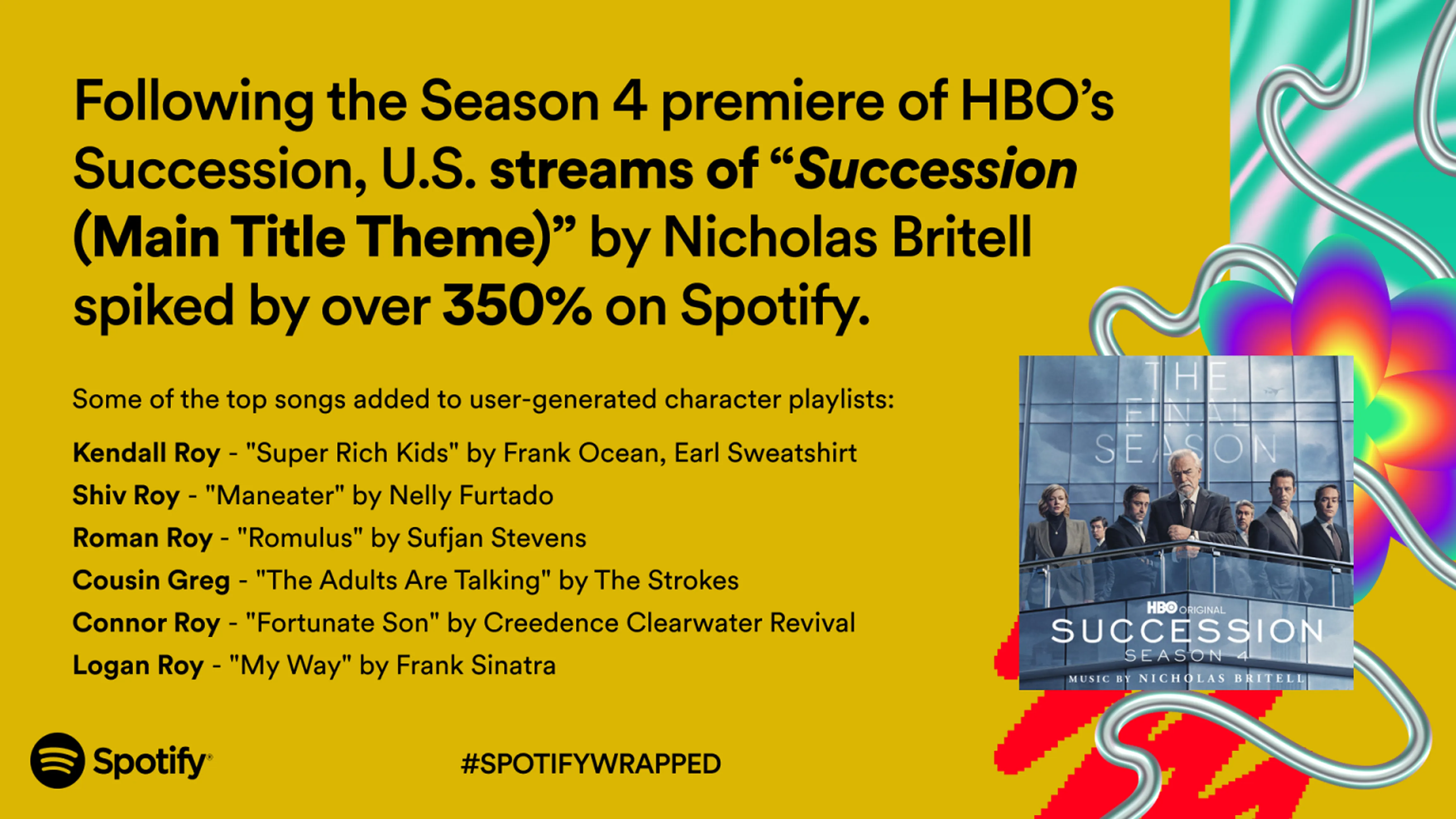
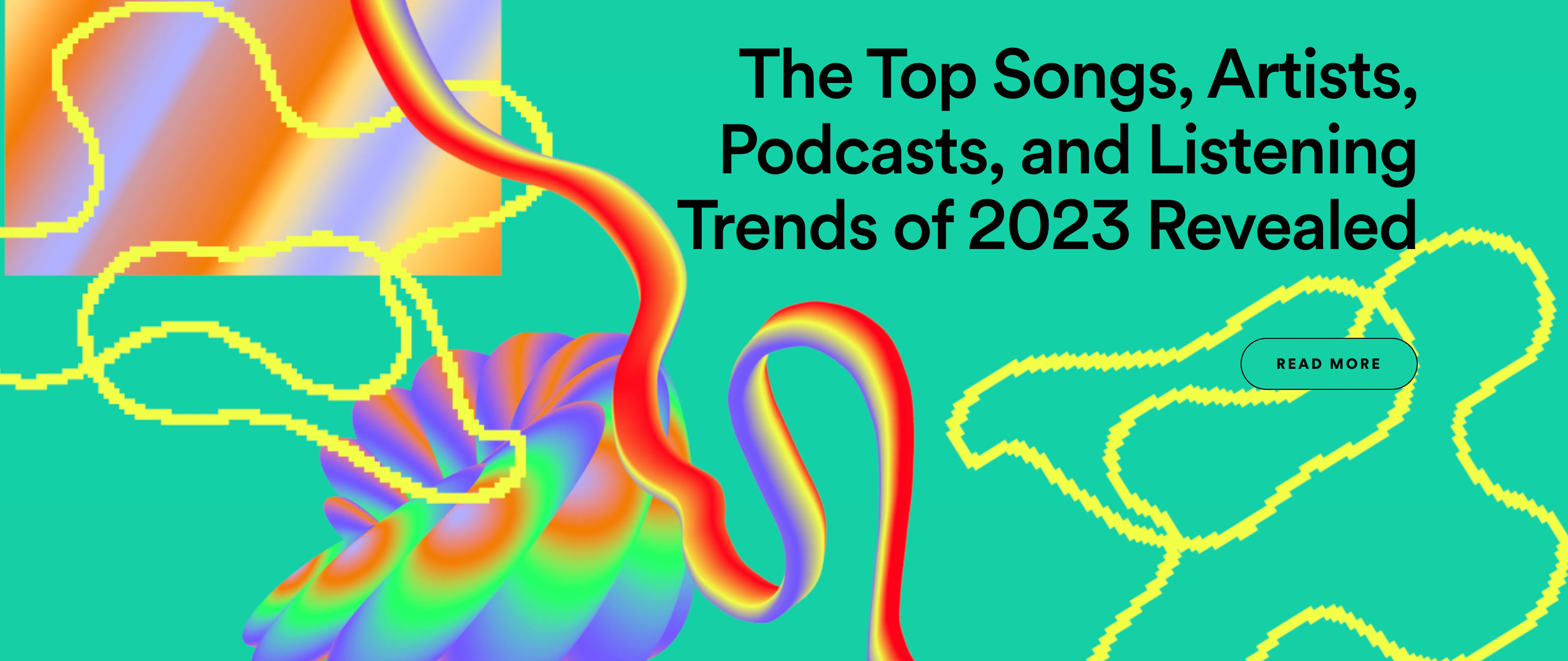
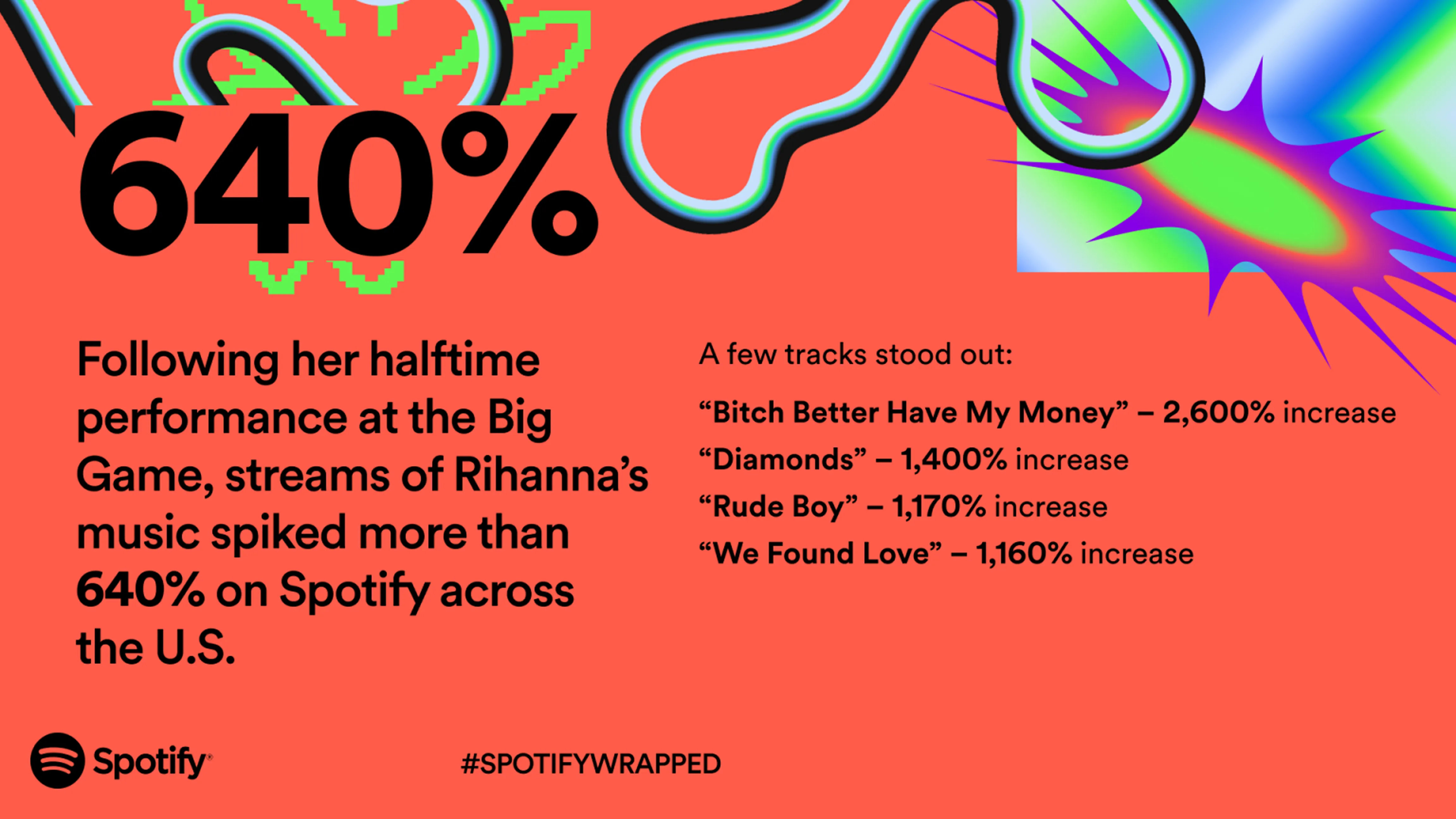
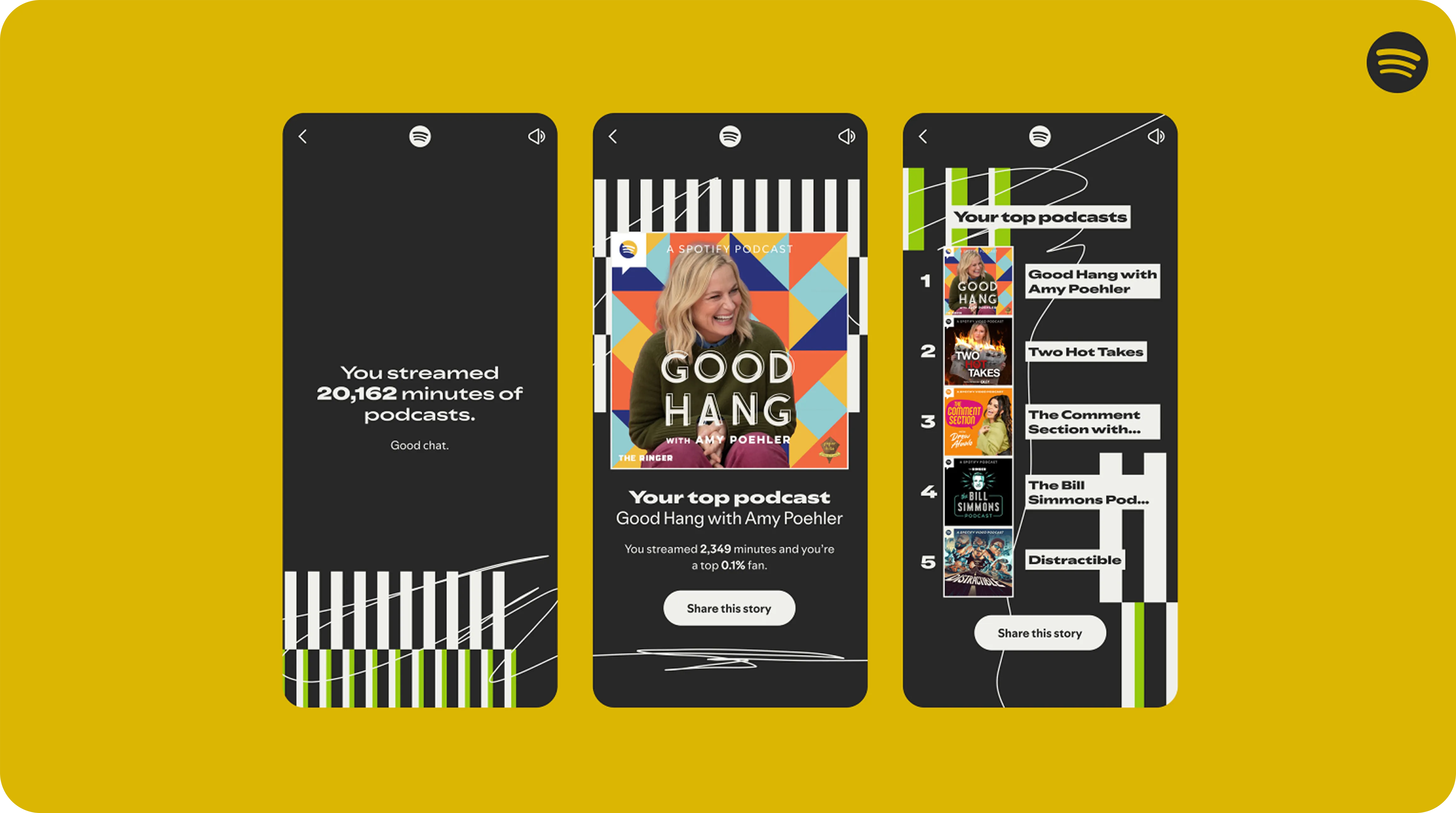
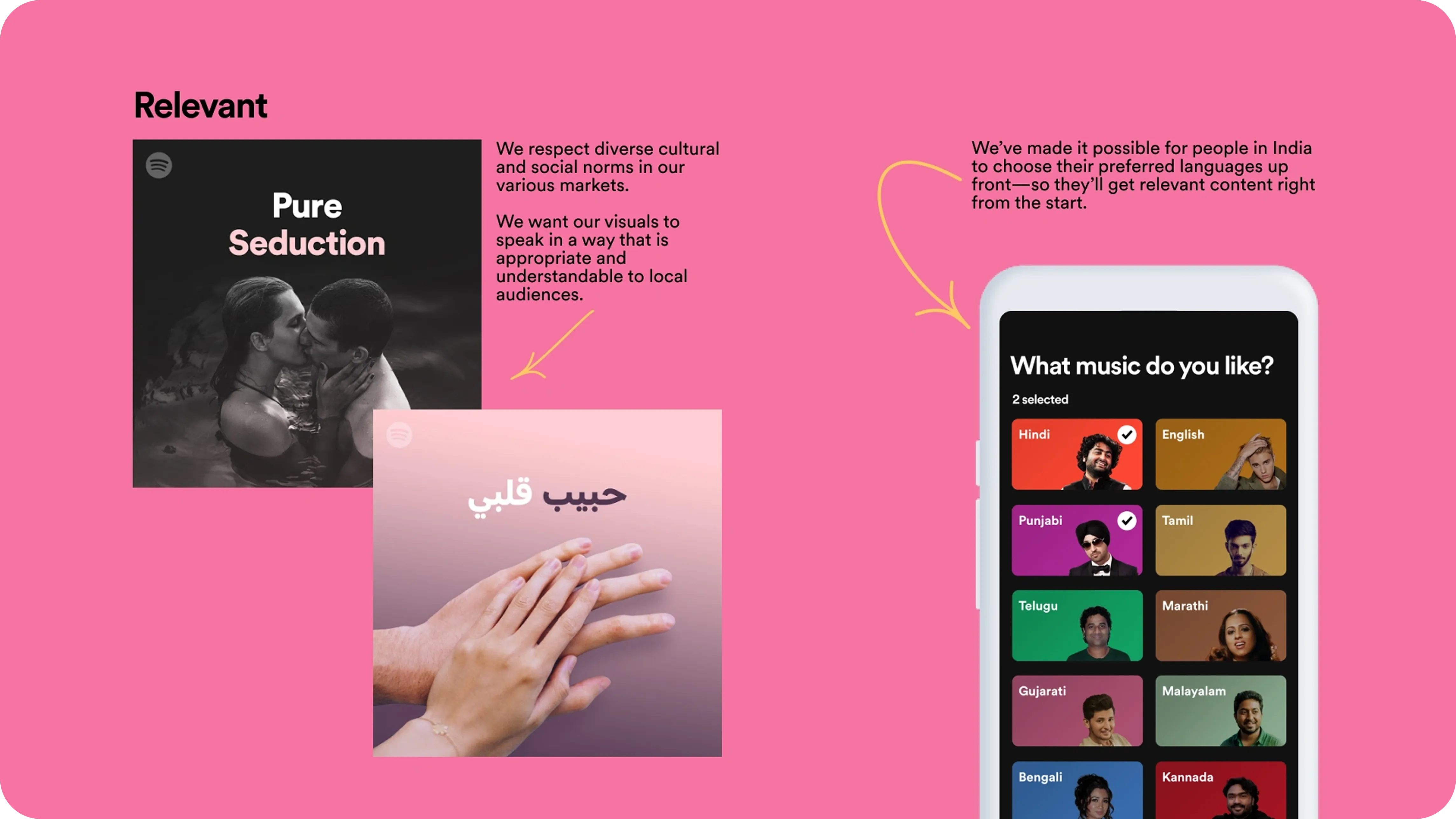
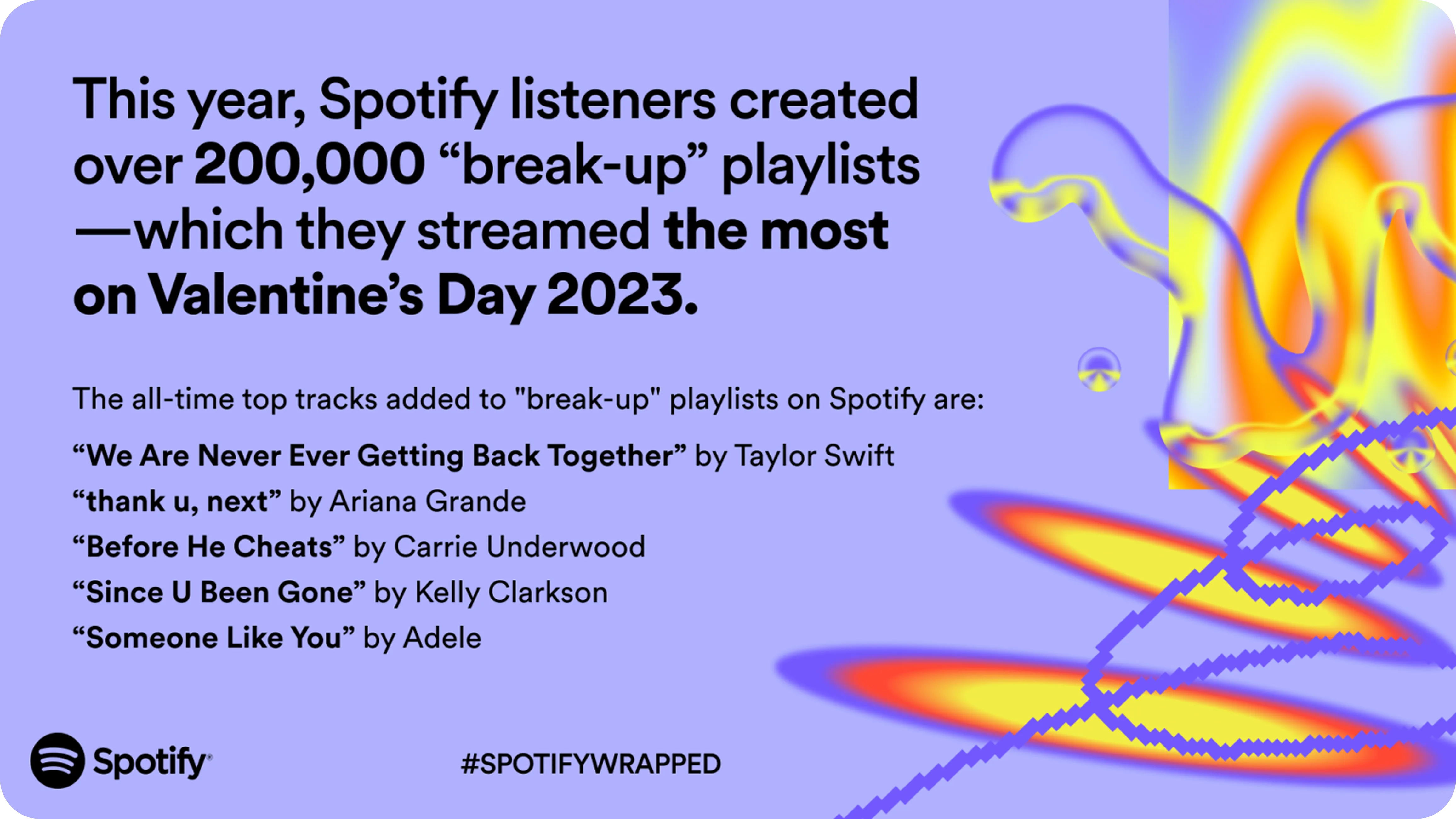
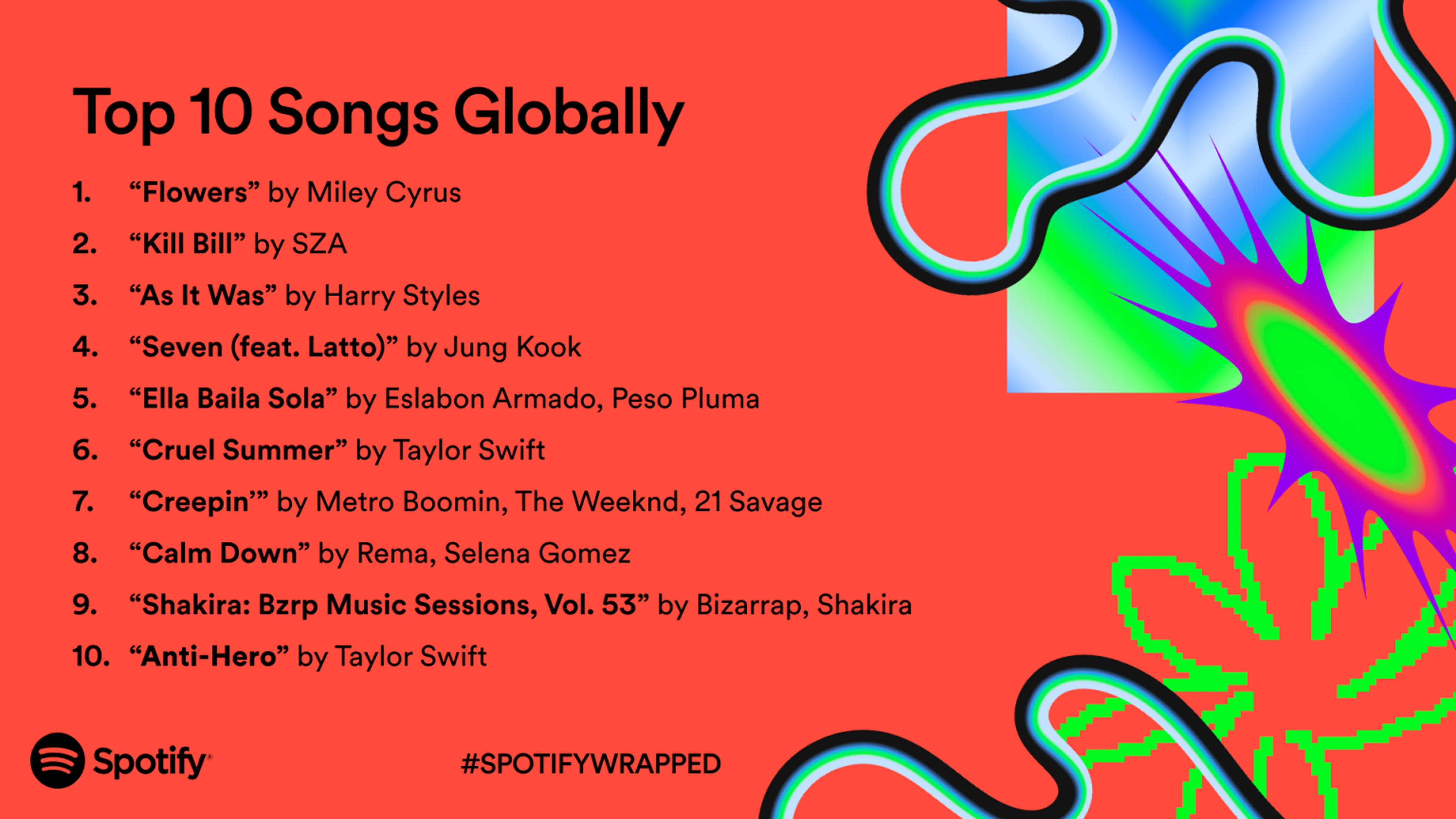
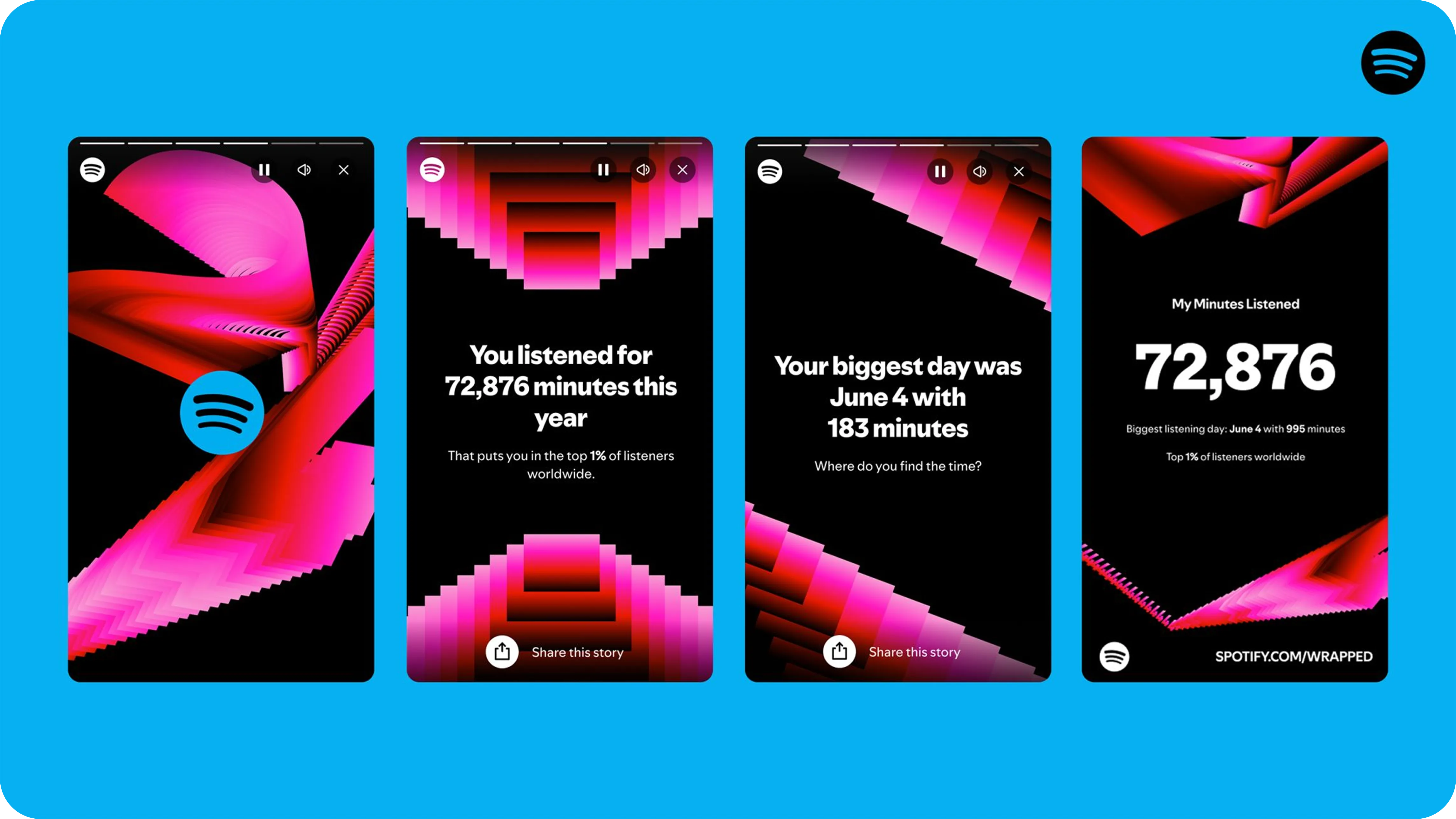
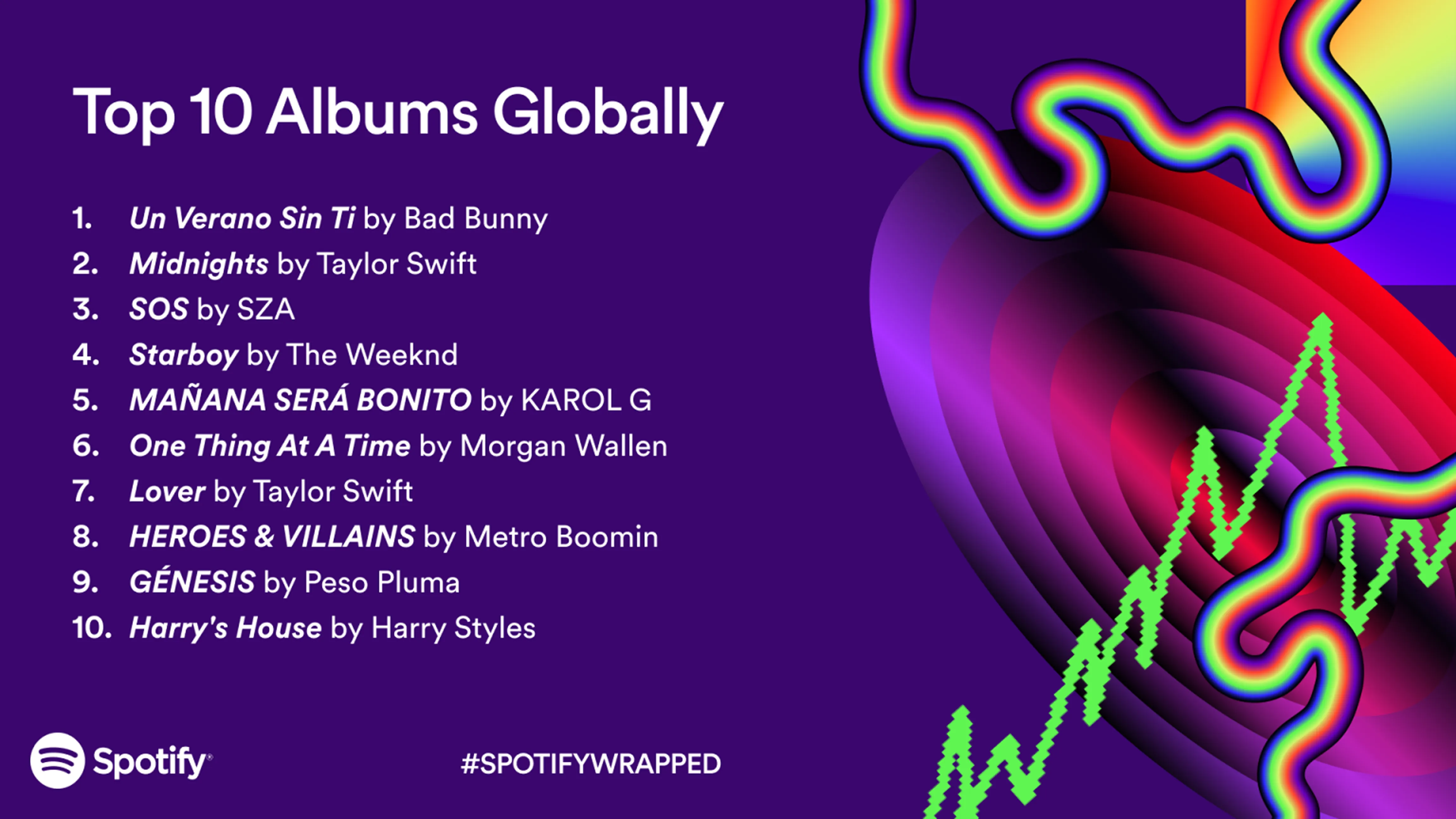
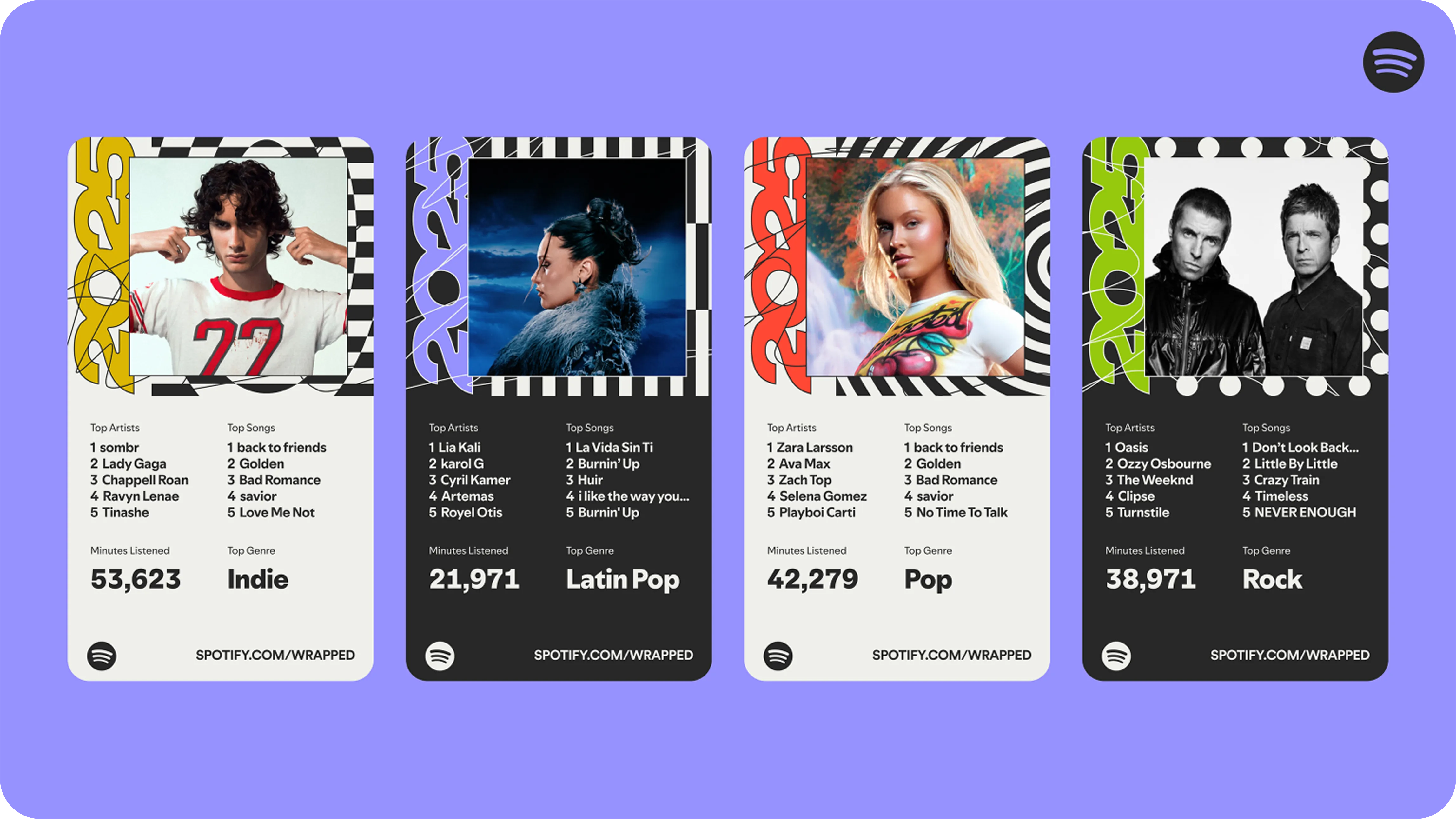
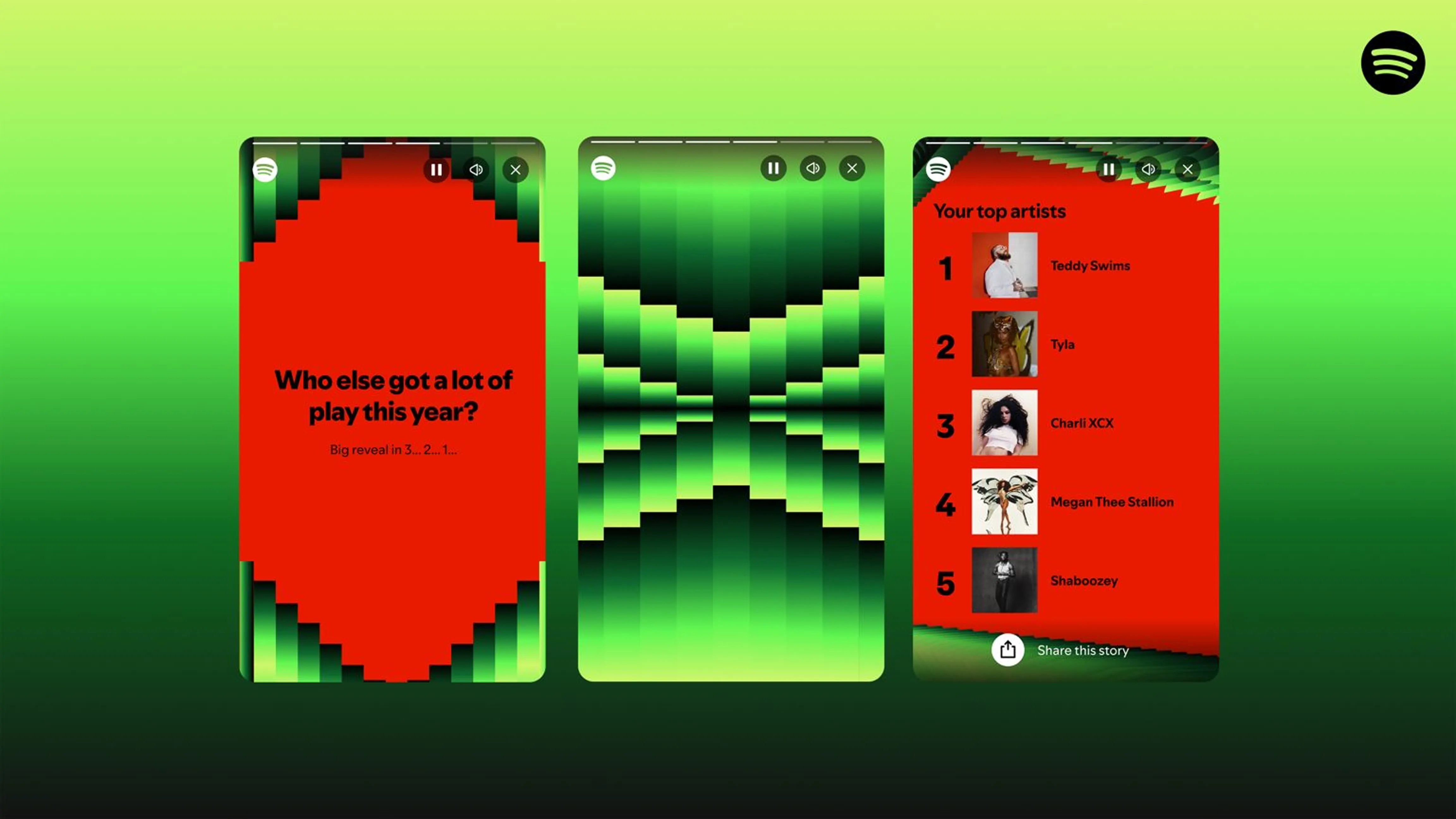
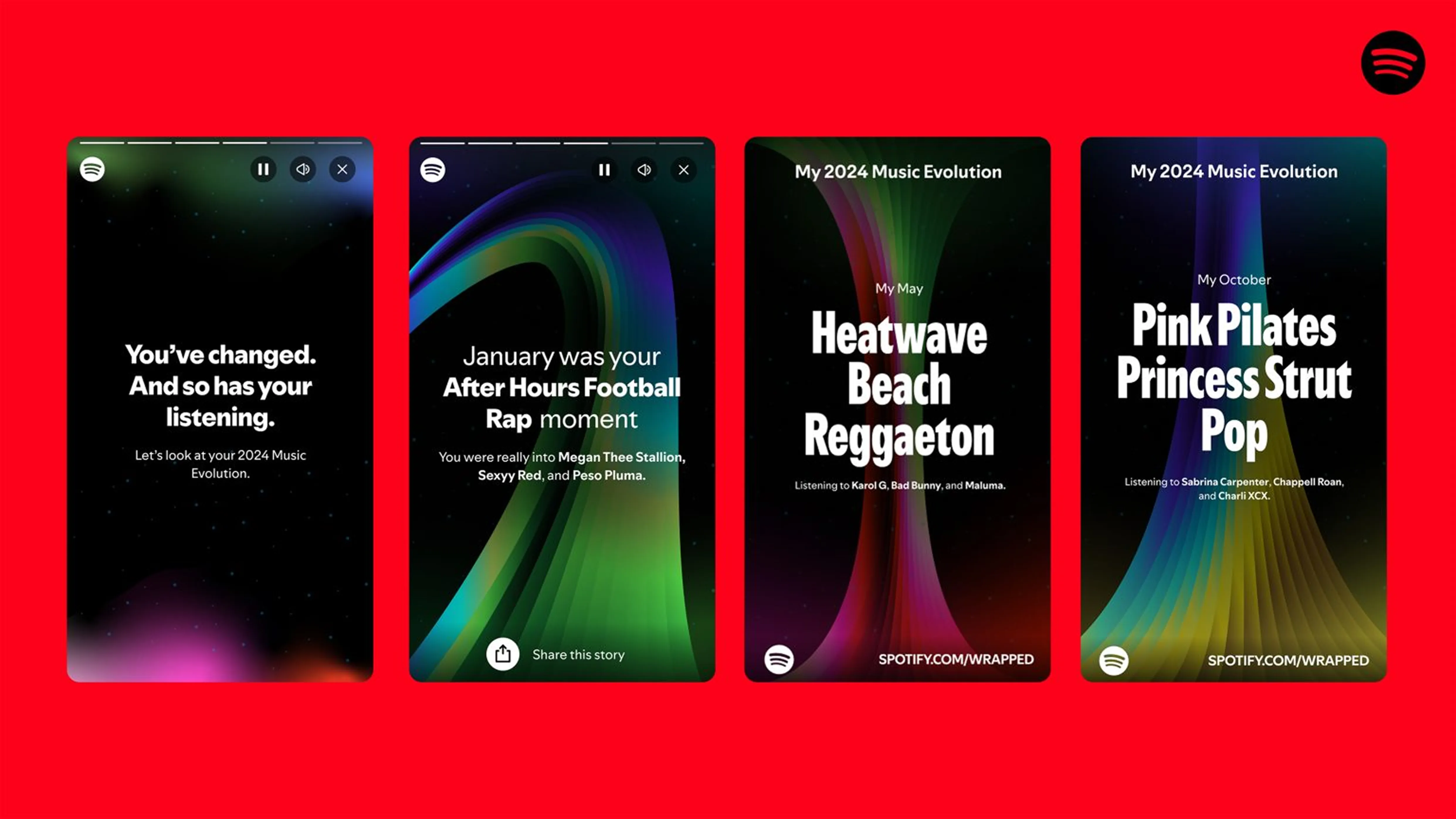
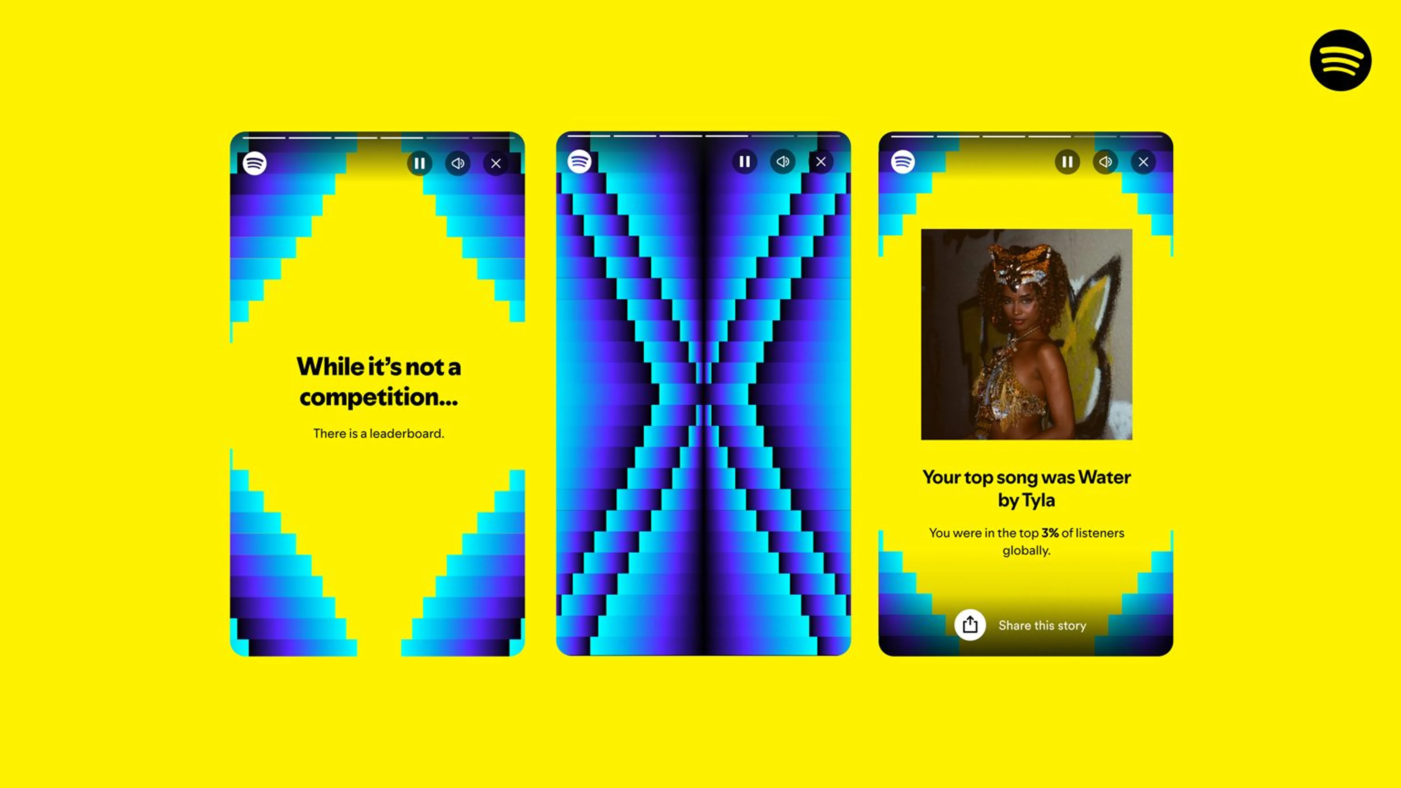
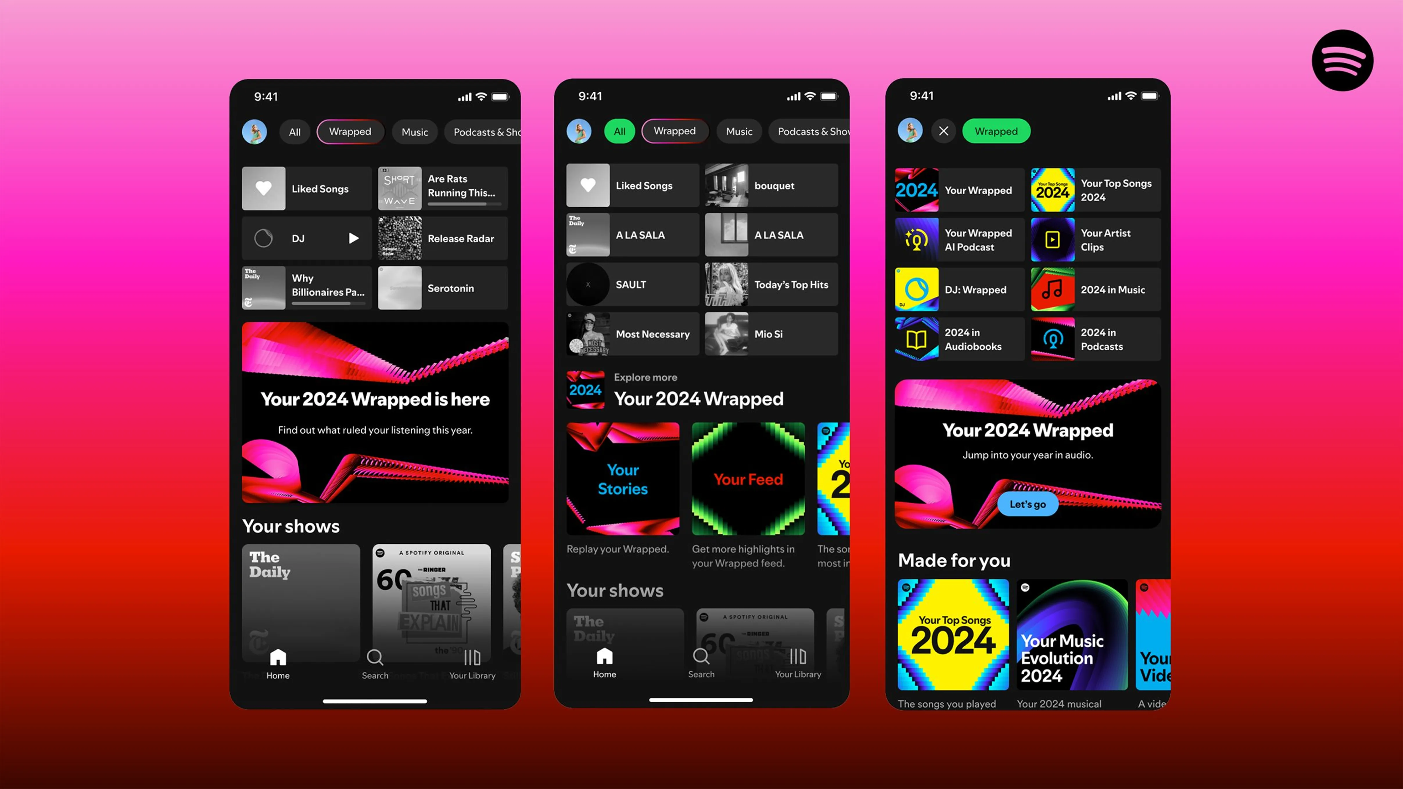
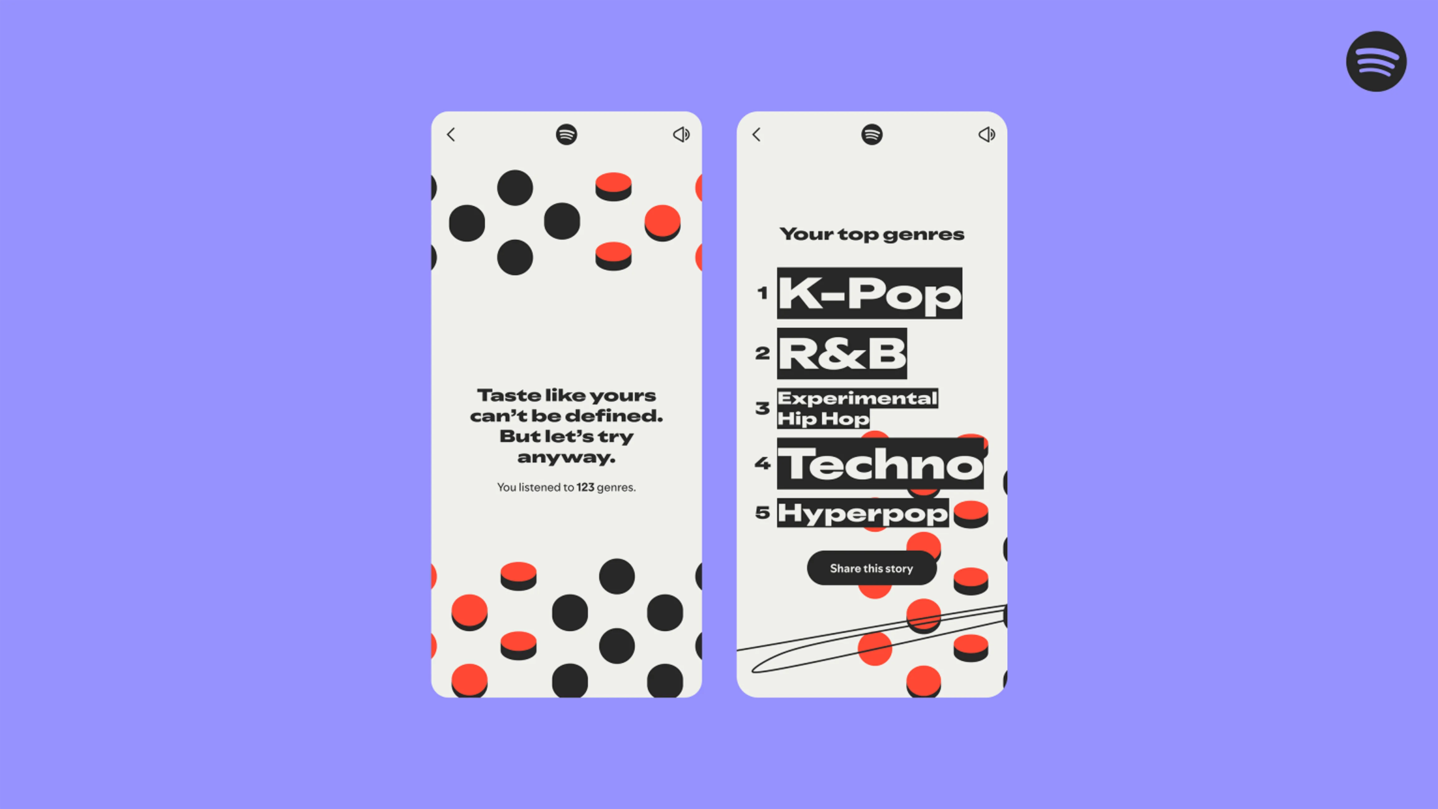
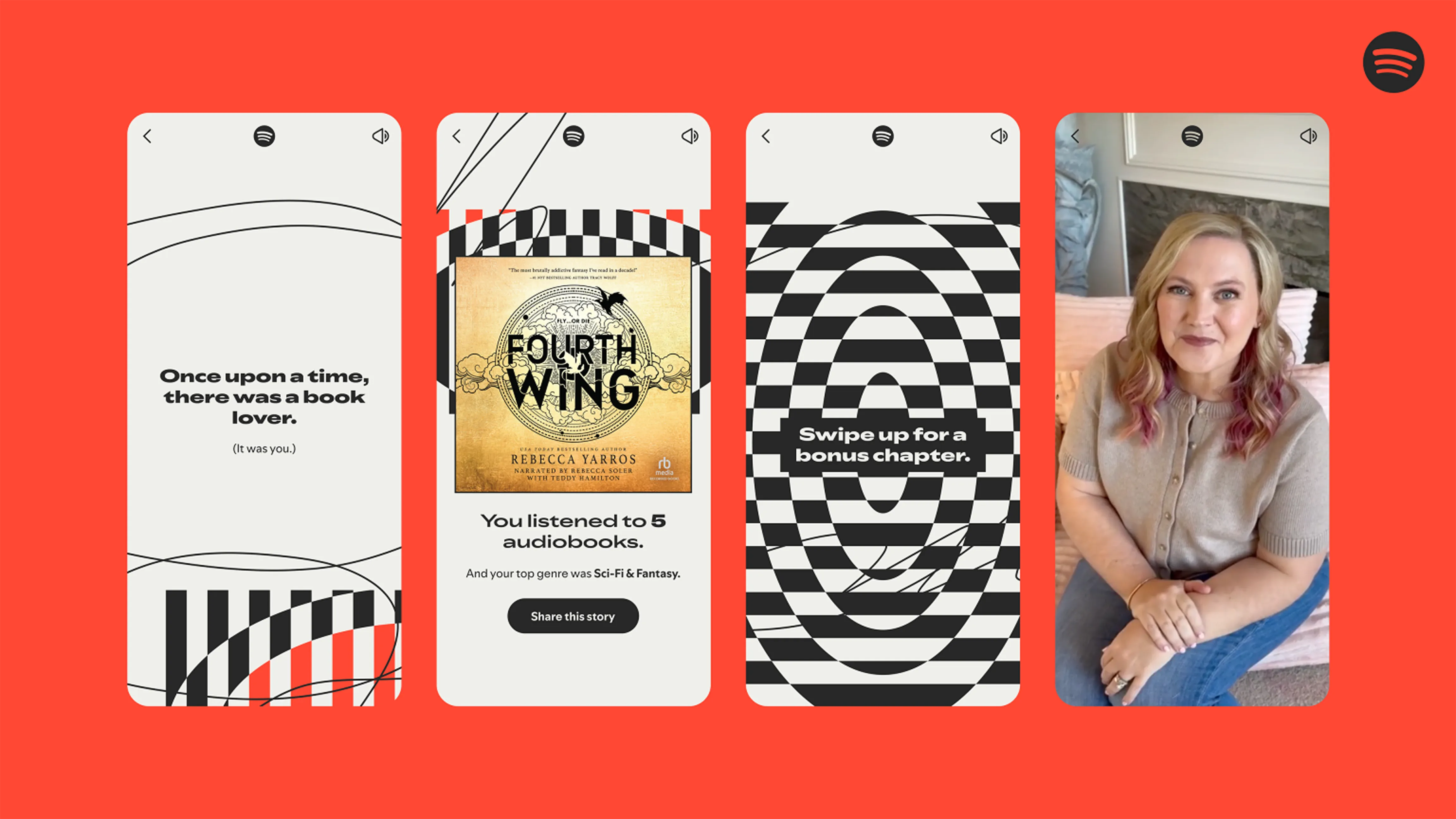
Spotify’s branding spans over a series of different sectors, causing it to exist as a plethora of styles and aesthetics.
Although appearing incredibly cohesive at first glance, Spotify’s branding is quite contradictory. In their guidelines, the company states – Do get creative with surprising color combinations, but Don’t introduce new colors outside our brand palette.
Trying to understand this deeper, I attempted to audit their ‘brand palette.’ Because what even is Spotify’s ‘brand palette’?
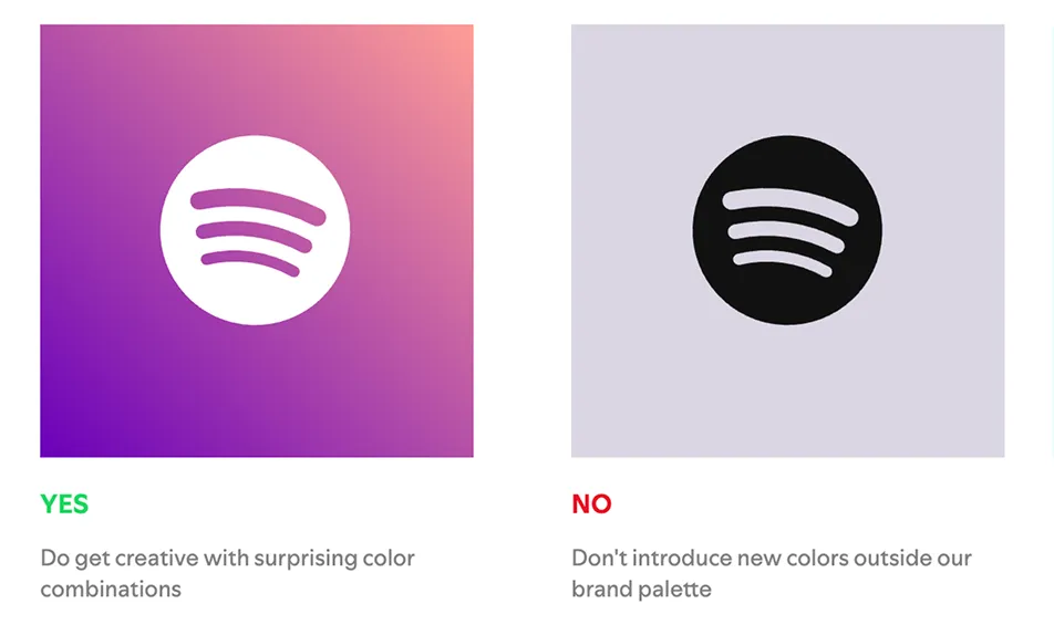
Screenshot from Spotify’s brand guidelines.
My color audit, carried out across Spotify’s brand identity, Spotify’s native app, Spotify Design, and Spotify Wrapped (2023, 2024 and 2025).
The short answer is, it is a lot. Over the years, Spotify has accumulated several sub-brands, including a separate blog identity titled Spotify Design, and the infamous Spotify Wrapped. What’s more, their own app interface also holds a range of colors for its UI elements – buttons, category cards, and genre tags – none of which appear in the official instructions.
As a result, their palette expands far beyond the green, black, and white in their brand guidelines. Instead, Spotify’s palette amasses over 40 hex codes, and this is just from my own research.
Interestingly, Wrapped 2025 had just launched during the final development phase of this project. Wanting to stay true to Spotify’s vision, I paid close attention to the launch, trying to understand what decisions the Wrapped team made, and why.
Speaking in a Spotify Selects interview, Head of Brand Design Rasmus Wangelin stated:
We drew a lot from audio culture from the 1980s and 1990s, when people were making mixtapes, doodling on cassette inserts, and designing club flyers and zines by hand. It was a time when creativity came from limited means, and that sense of imperfection and individuality felt right for this year. 2025 Wrapped channels that DIY energy and that feeling of, this is mine.
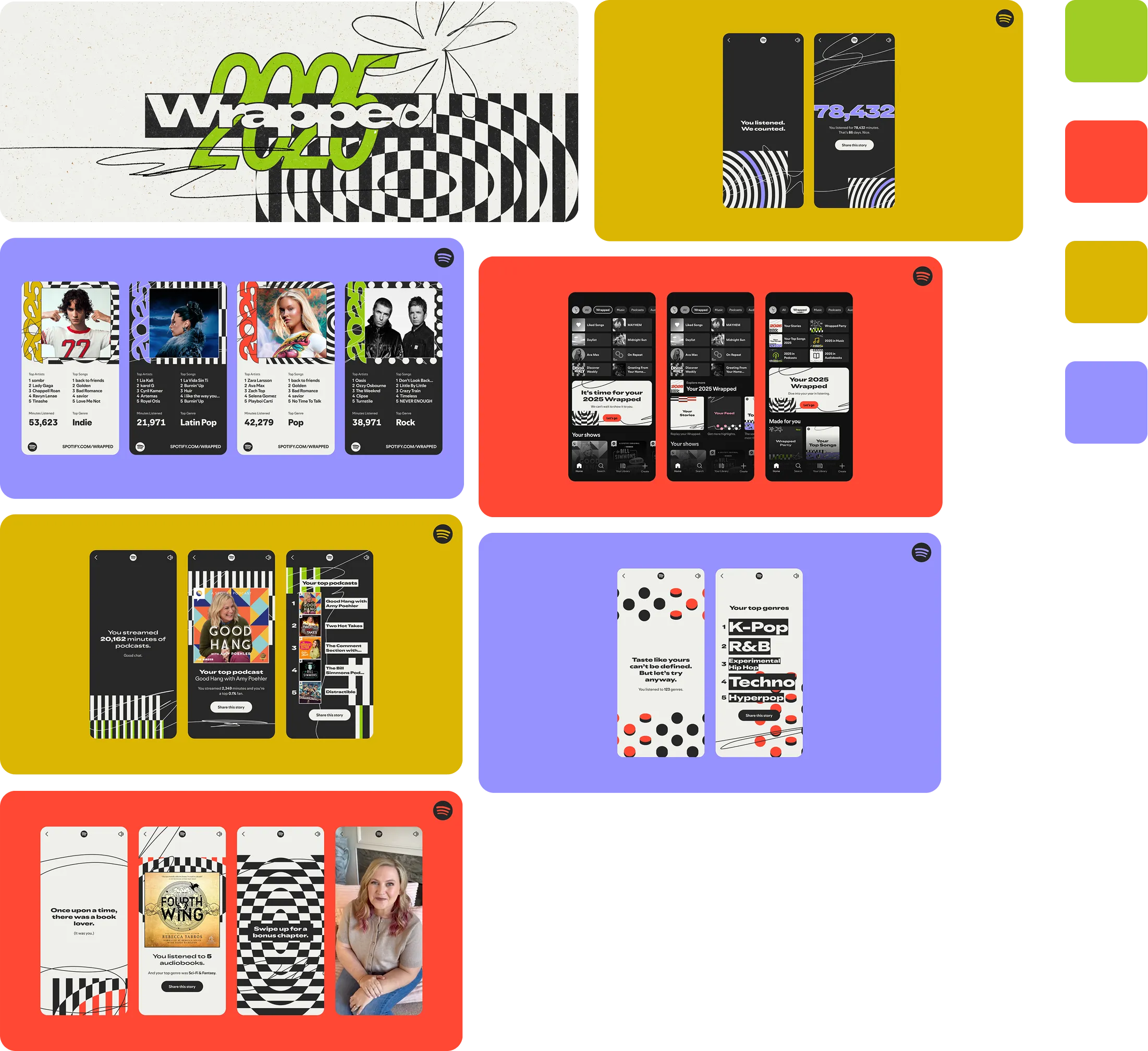
Wrapped 2025 branding.
Consequently, I decided to pull from the same themes in my design, incorporating hand-drawn lines, noise textures and VHS-style colors. I wanted Soundtrack to feel gritty, imperfect, and most of all, hand-made.
Using nostalgic imagery for the color selection process.
design
tying it all together
All this came together in the central graphic – our feature logo. We had already established a sort of visual language: retro, rough, tactile. Because of this, I was thinking of CDs and cassettes for our icon. Next, I referred back to the Spotify Design guidelines. ‘Humanness,’ i.e. incorporating user profile pictures, is actually a very important part of their identity. They encourage their team to include users into their designs as much as possible, to make it feel like a community.
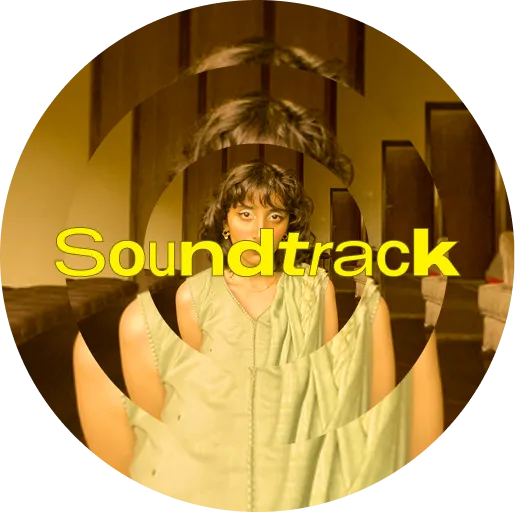
Combining these two concepts, I landed on the profile picture/CD graphic: our logo.
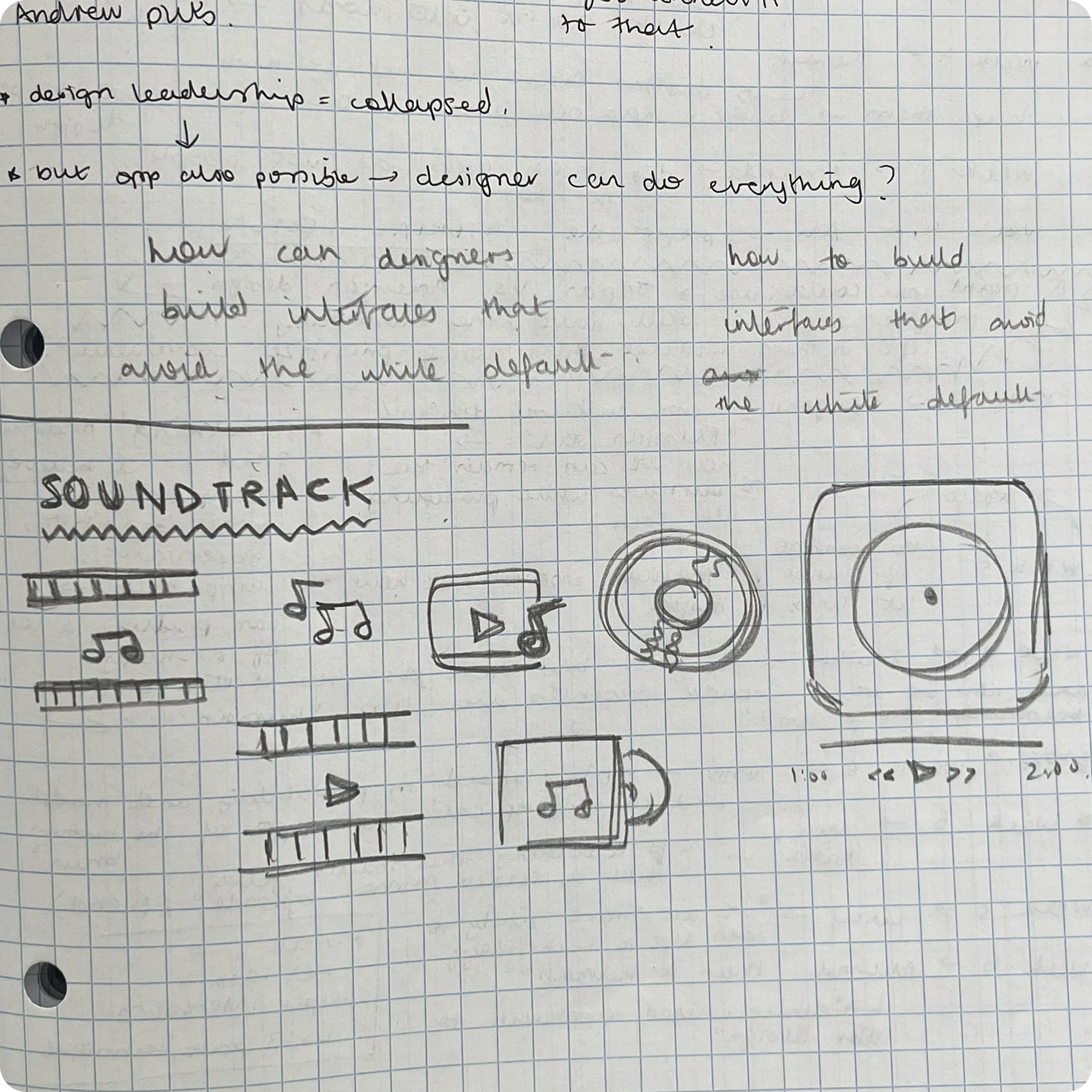


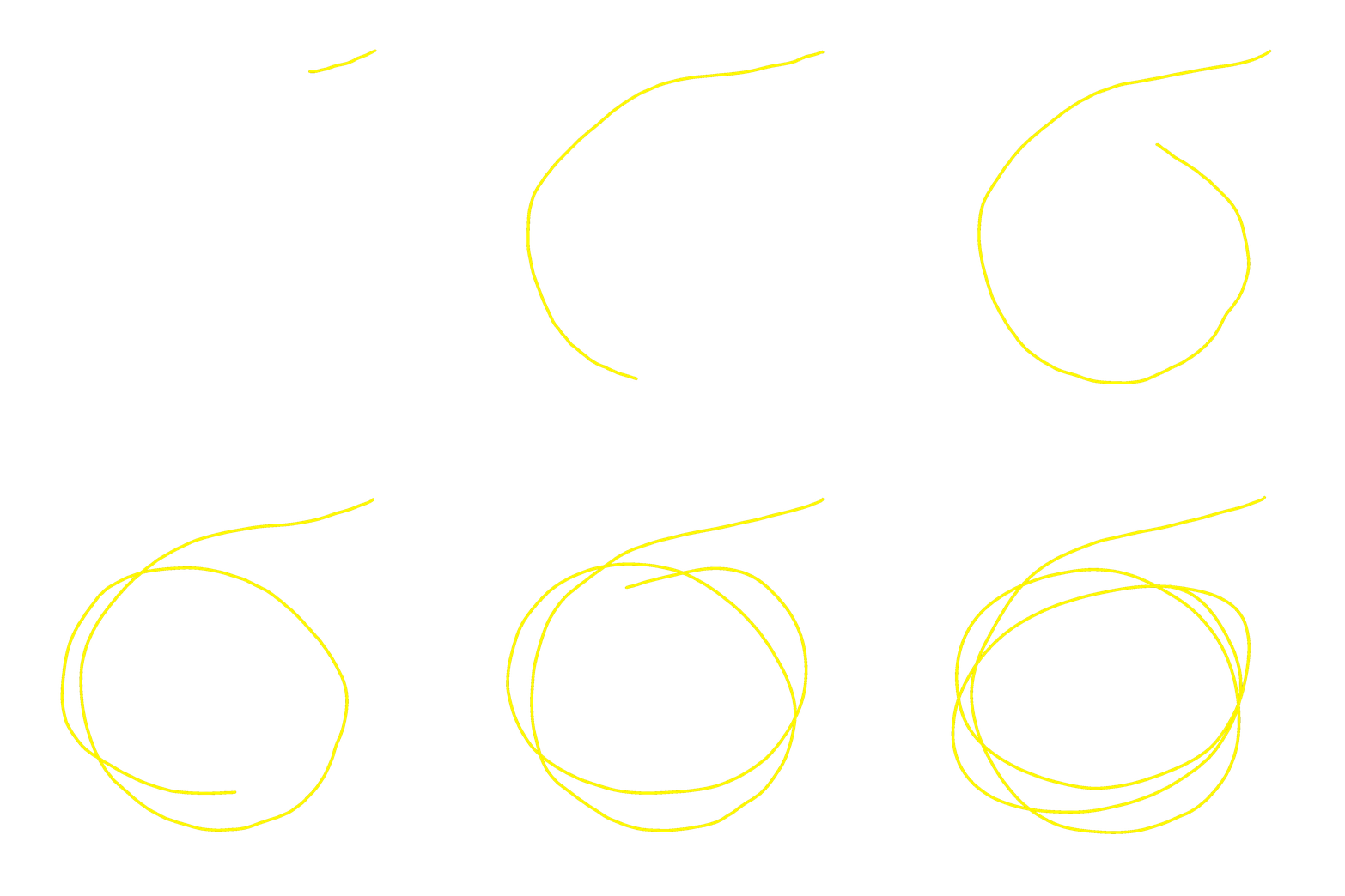
Logo sketches
Spotify Design guidelines
User profile picture
Final graphic
Now, all that was missing was some type. Because all the elements of this feature are so dynamic – the CDs, the timeline, the concept of time-travel, I wanted the typography to feel the same. Thus, I decided on a variable, stretched out font that always looks like it’s in motion.
Final logo graphic.
Paired with our graphic, the logo was complete – and with it, the branding.
solution
rewind your day, replay the music
The final feature comes forth in four forms – the home page view, the feature home itself, the day playlists within the feature’s months, and finally, the individual playlist view.
Homepage view
Soundtrack first appears on the regular Spotify homepage as a small snippet – similar to how Spotify introduces other features like Wrapped or new recommendations. This is the first-time view for new users, acting as a preview of what the feature has to offer. Tapping into it takes them inside.
Feature home
This is the feature’s own central homepage. At the top, users can access their month-based listening history – these are not singular monthly playlists, but a collection of day-based playlists for each month. Below that, users can explore additional sub-features: certain categorisations of songs grouped together based on patterns from that month, as well as a location-based section that groups songs you listened to a lot in a specific place.
Monthly overview
Within each month, there is a playlist for every day you listened to music. The date of that day sits on the cover of each playlist, and the name of the playlist is based on the vibe of that particular listening session.
Day-based playlist
Finally, the timeline view. This is what you see when you tap into a day playlist from the previous screen. The playlist looks a little different from your regular Spotify playlist – songs appear in chronological order, allowing you to feel like you are travelling back in time.