problem
I have too many thoughts
Task paralysis is very real. Present in both neurodivergent and neurotypical individuals, this is a psychological state where one is intensely overwhelmed and unable to initiate their work (let alone complete it!).
research
so I went looking for answers
I wondered if there were applications catering to this problem. Upon researching, I came across some disappointing insights.
It went a lot deeper than those 4 screenshots though. After dissecting a range of apps built for time and task management, I noticed each of them followed the same few layouts and visuals. And clearly, none of them were working.
Narrowing down their similarities, I created my own distinct PRD, keeping in mind neurodivergents (like me!). This included:
- a messy ‘dump’ section – something to replicate our chaotic brains.
- a way of organizing / neatening this dump.
- a traditional calendar mode.
Breakdown of competitor audit in Figma.
design
functionality – making it inviting
My favorite part! From the very beginning, I was certain about 2 things: this app had to be inviting, and it had to be warm.
After seeing all the current apps in the market, I craved one thing – simplicity. To make this app simple would be to make it inviting. Thus, I began with the most minimal prototypes I could think of. The first ‘dump’ section was clear – scattered thoughts. I wanted the app to make a human feel like they felt when they were disorganized, I wanted to bring that emotion out onto the interface.
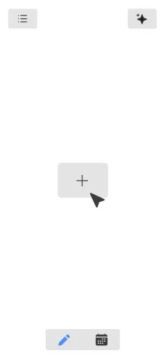
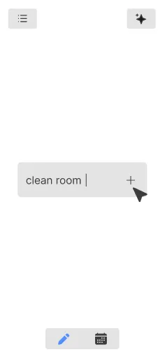
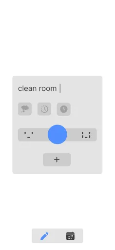
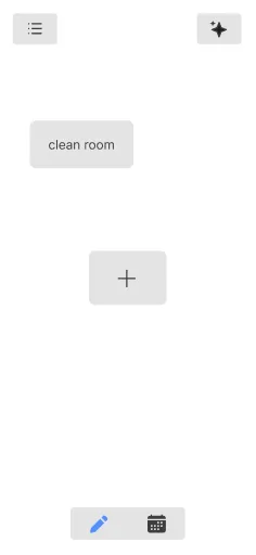
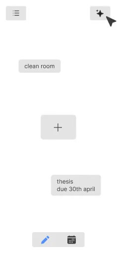
Low-fi prototype screens for our dump section.
The third screen in these is an interesting one: I was trying to come up with some sort of input card where users could indicate what kind of task it was. This was necessary for the ‘organization’ that would come in later.
Initially, I came up with these options – a thought bubble, which, when clicked, denoted a ’life’ task (e.g. cleaning or cooking); a clock which allowed you to set a task which had a duration (e.g. a meeting); and a clock which allowed you to set a task which had a deadline. And finally, below these buttons lies an element I am extremely fond of – the ’stress slider.’ This would allow users to input how scared they were of said task. The more scared a user was, the more likely that task was either huge or extremely urgent!
(I know the input card looks a little confusing, but we’ll come back to that later).
The next section, however, i.e. the organized screen, was a bit of a problem. There were so many ways tasks could be organized – in the form of lists, through sizing and color, and even through graphs. Out of all the visualizations on the left, which one works for you?

For the longest time, The Eisenhower MatrixA prioritization method that sorts tasks by urgency and importance into 4 quadrants: do, schedule, delegate, delete. was one of the few task methods that actually worked for me. That was the thought behind the graph. Yet, upon user reviews, it was clear that the differently sized tasks were the easiest to understand, and hence, the most impactful.
By far, the most challenging was the calendar mode. Because I was creating for brains that could not understand time, I was trying to simplify the display of time.
More specifically, I wanted to make time seem tangible – each hour represented by a dot, each set of dots a day, each grid of dots a month, and each chunk of grids a year. I wanted individuals to see as much time as possible so that they could schedule as much as possible.
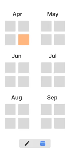
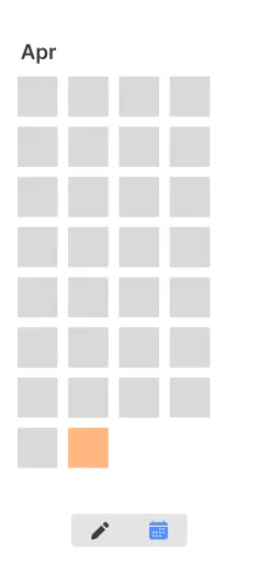
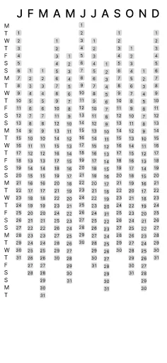
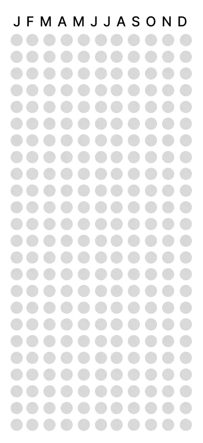
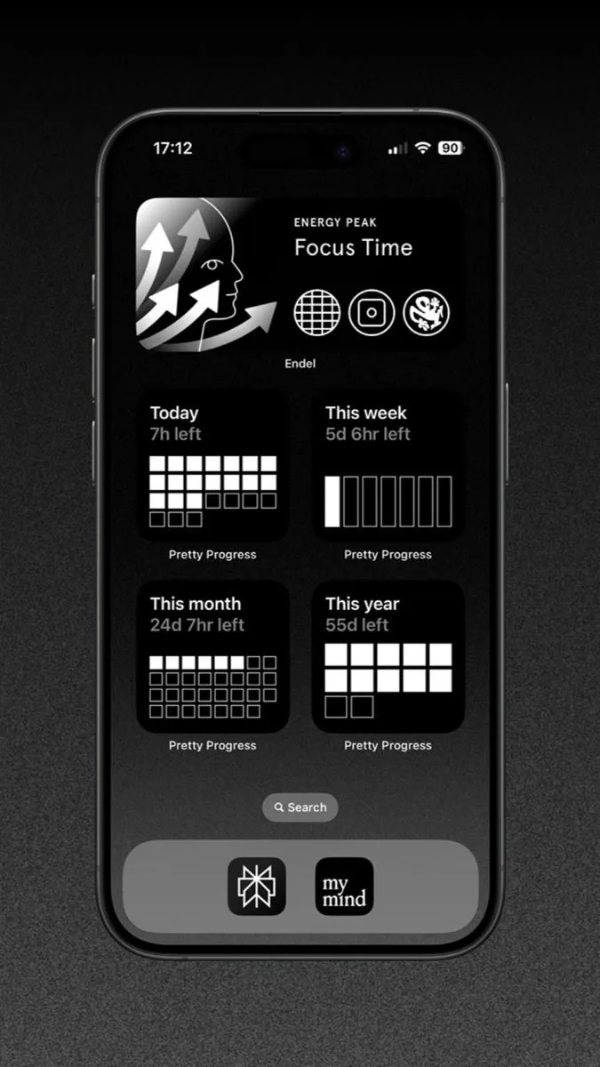
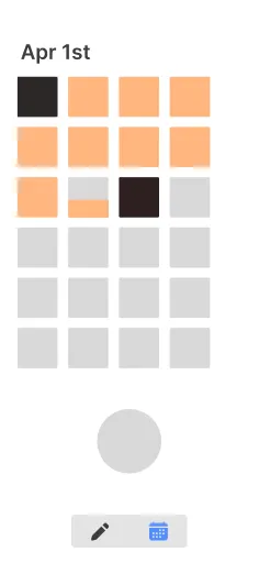
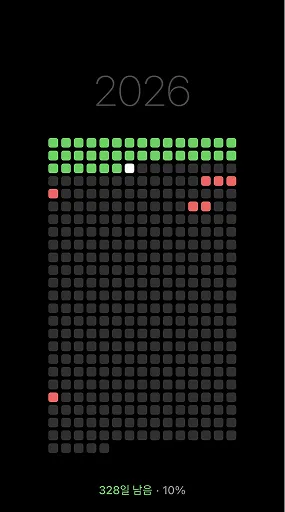
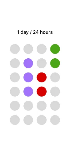
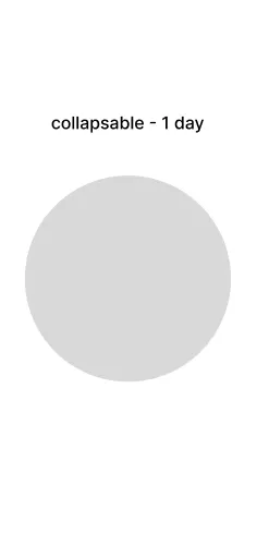
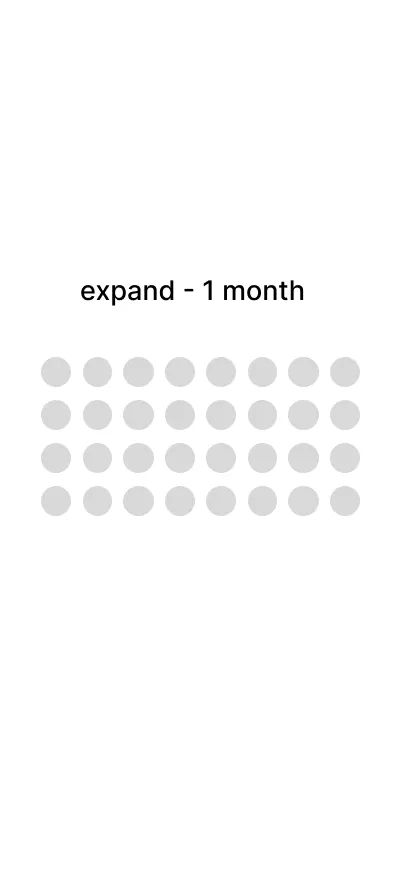
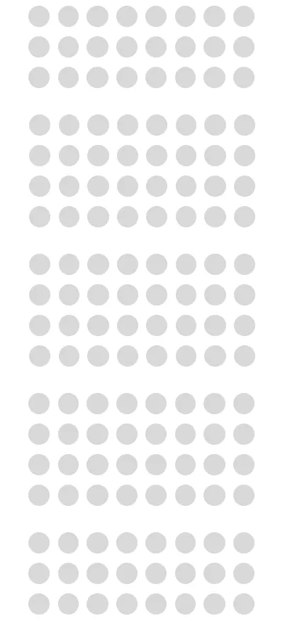
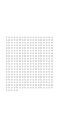
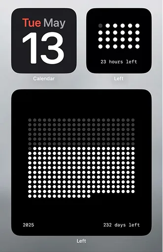
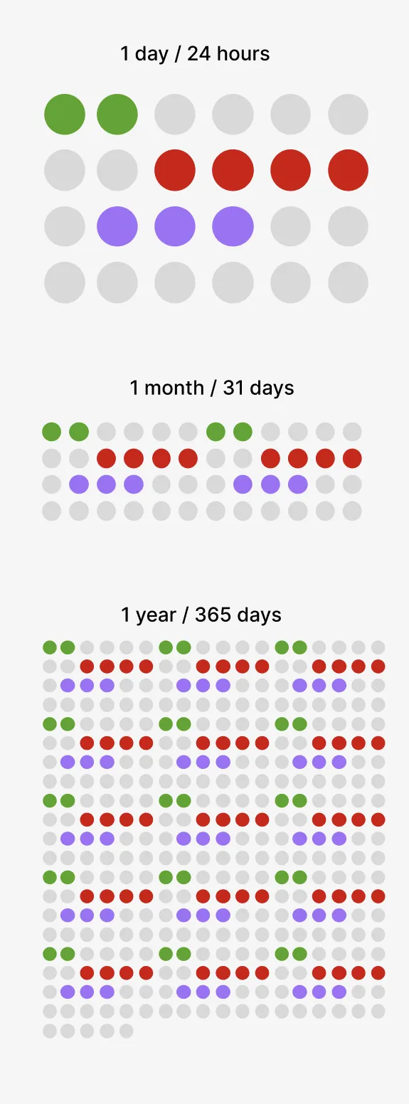
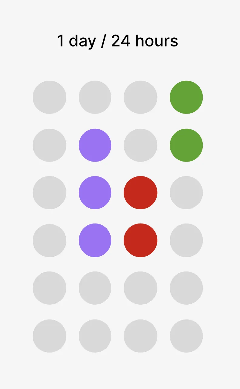
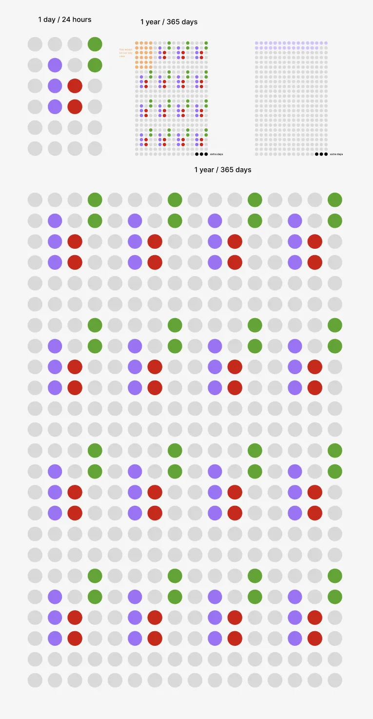

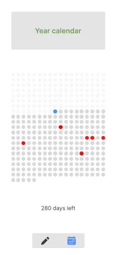
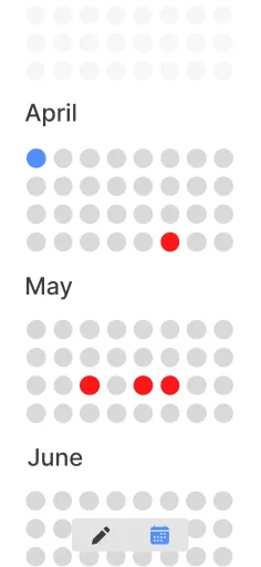
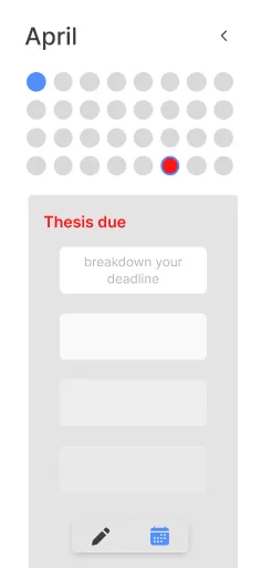
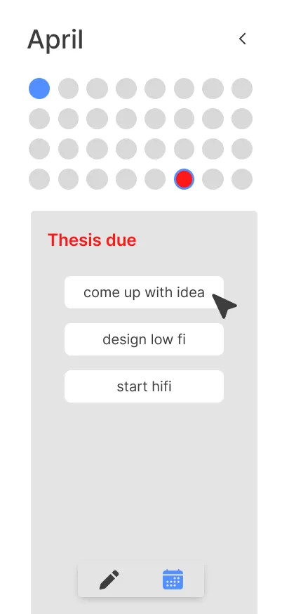
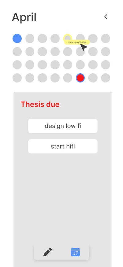
After much suffering, I was able to narrow it down to these calendar screens at the low-fi level.
The idea was to have a year-view calendar so you could be prepared for as many deadlines as possible in advance. Then, as the user zooms in, they would shift to month view (the traditional kind). Within month view, users could break down giant tasks into smaller tasks and schedule them by dragging them out onto the calendar (this was still a bit clunky but the good stuff is coming, I promise).
design
branding – making it warm
At first I thought warmth = beige and Sans Serif text. I soon came to realise this was an effect of Claude-ification – with the current success of Claude‘s branding, a lot of upcoming digital products are looking suspiciously similar. Consistently being thrown the same interfaces with the same aesthetic, I was falling victim to the sickness, before my professor opened my eyes.
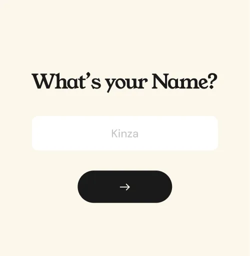
This first rendition of typefaces, using Young Serif and DM Sans, was very much giving Claude. Curse you Anthropic!
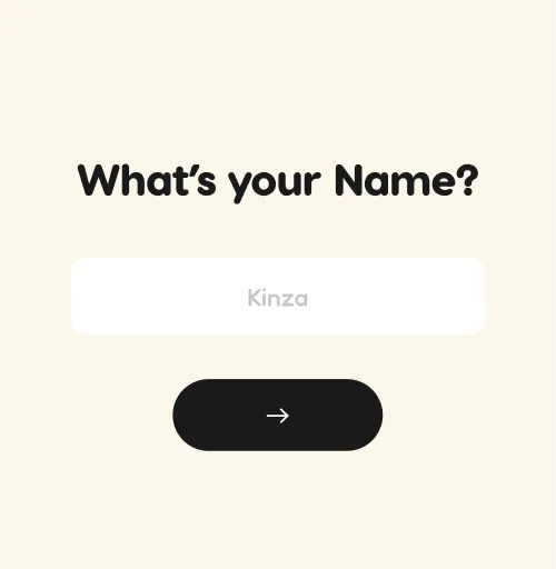
The second rendition explored more rounded typefaces, trying to mimic playful-ness and childlike-ness. But Visby Round and Fredoka were perhaps, too childish.
The third and final rendition. This one really hit the sweet spot, bringing the right level of play and polish. Pictured here: Averia Serif Libre and Satoshi.
Averia Serif Libre combines the sharpness of Young Serif and the softness of Visby Round seamlessly.
Now, coming to our de-Claude-ification from the color perspective. Remember when I said we’d come back to the input card?
Interestingly, this card was our driving force for color. Because it had so many elements, it served as the perfect test of which shades worked and which didn’t. The process is highlighted below – at first, there was still some functionality work left. Following user testing, I received feedback that the duration picker was unnecessary, because deadline tasks could also have durations. Also, the ‘life’ task button was too vague. Instead, users wanted some form of a priority marker, so they could prioritize life tasks if they didn’t have a deadline. So I got rid of the duration button, added a deadline toggle, and a priority marker when the deadline toggle is off (pictured further below).
Once the language was finalized, colors could now be adjusted. Trying to visibly differ from the Claude aesthetic, I first tried many shades of blue (I wanted to convey calmness and safety).
My professor, however, hinted that whilst calmness was good, this scheme was, perhaps, too calm. An element of pop was missing. Something to bring the whimsy back.
I agreed. float was supposed to be intuitive, not look like everybody else. So I played with brightness. I brightened the blue to a frightening extent. I liked this blue. It excited me.
One confession though. I secretly missed the beige. So I brought it back.
Once we had that as the base again, everything made sense. I was able to pick secondary colors such as the purple easily.
Oh, and the final touch – my personal favorite – some texture to keep the hand-drawn whimsy alive.
solution
dump it, sort it, plan it
Finally, here’s what it all amounted to.
float is structured across three modes: dump, organize, and plan.
A persistent navbar sits at the bottom of the screen, letting you move between them at any point.
Dump – empty your brain
This is where you add your tasks. Upon typing in a task, you are presented with the input card, which then asks you some questions to further categorize that task:
- does it have a deadline?
- if not, how important is it to you?
- most importantly, how afraid are you of it?
Organize – make sense of the mess
This is where the magic happens, and what, in my opinion, sets float apart.
At the tap of one button, watch your scattered tasks dynamically shift, moving into positions that help you clearly see what to do first, and what to do last.
You don’t have to figure it out on your own anymore.
Plan – know what’s next
Lastly, this is the section where you can keep track of your tasks in the traditional manner – via a calendar and lists.
But once again, there are some surprises. Instead of just having a monthly calendar, users can zoom out to see their tasks on a yearly calendar.
download now
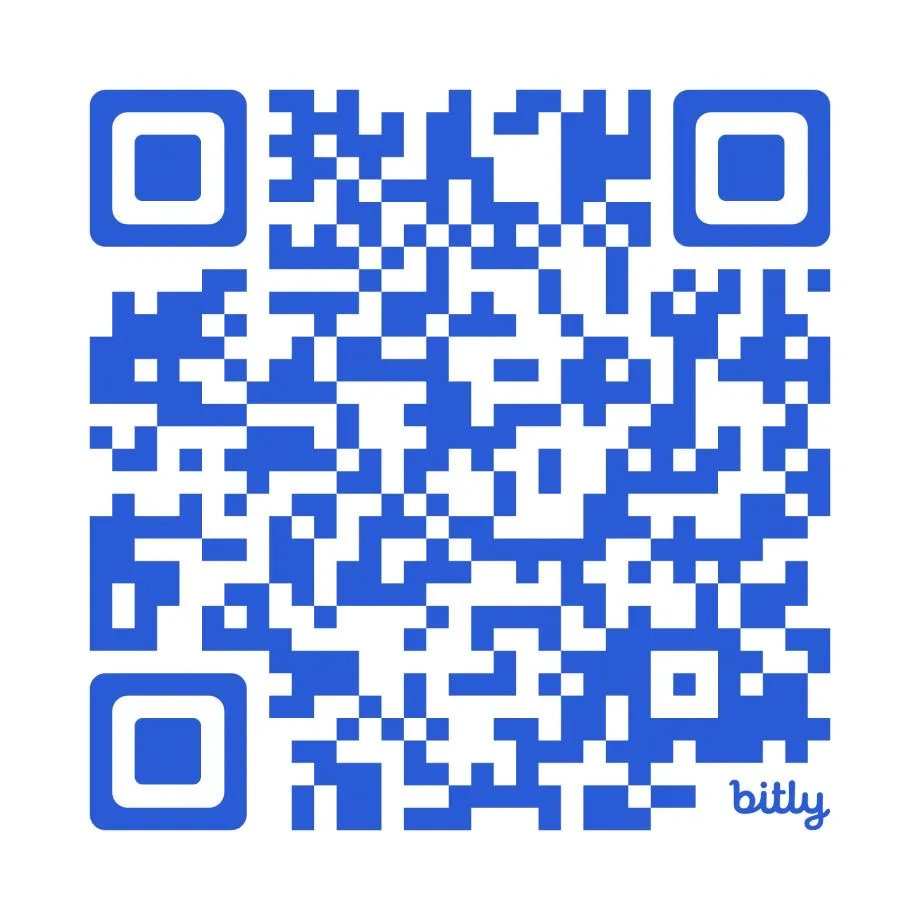
1. Scan the QR code to open float-kinza.netlify.app on your phone.
2. Tap the share icon in your browser.
3. Select Add to Home Screen to install float as an app.
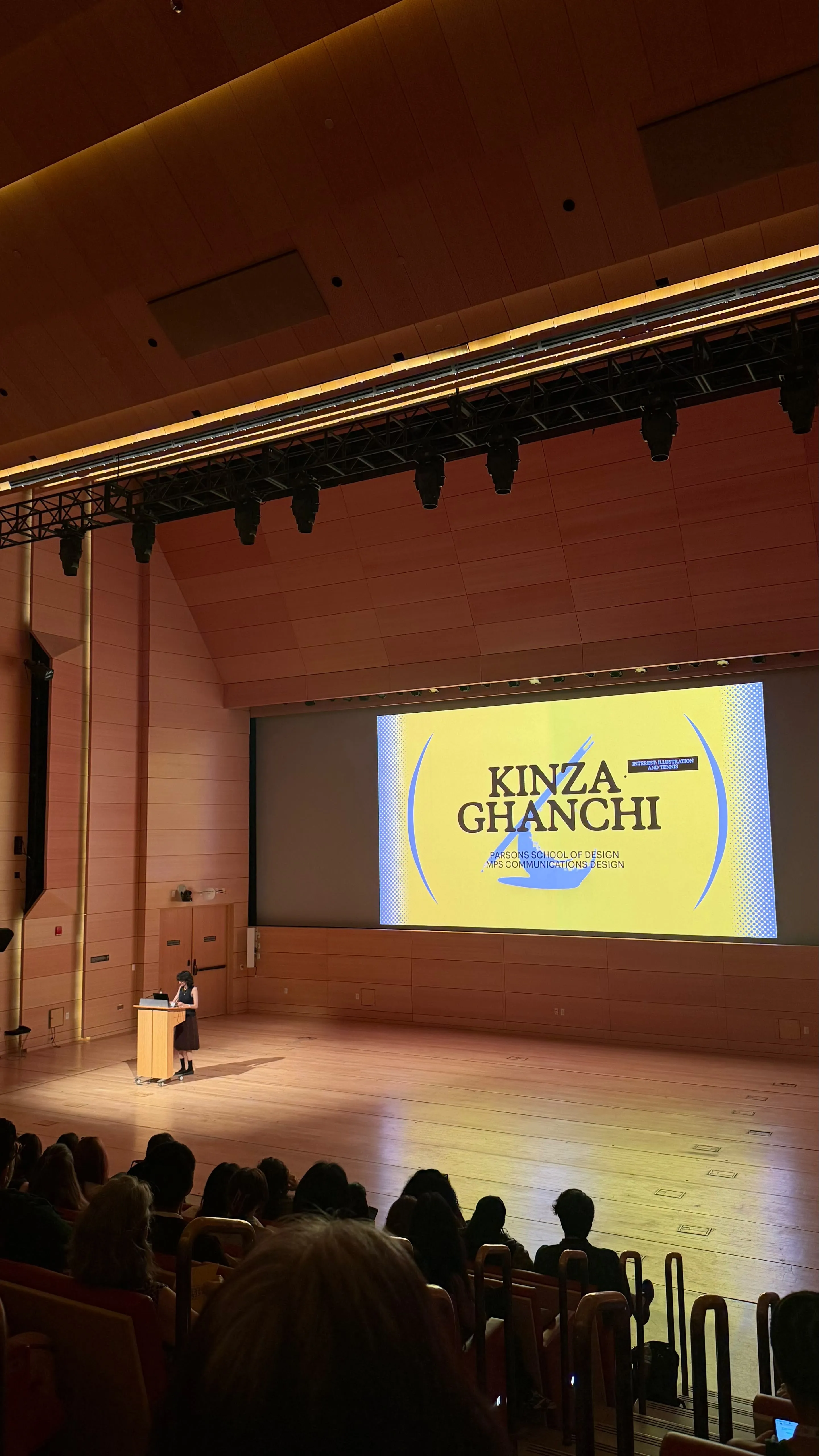
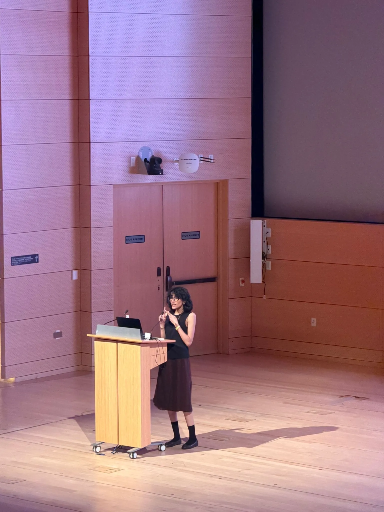
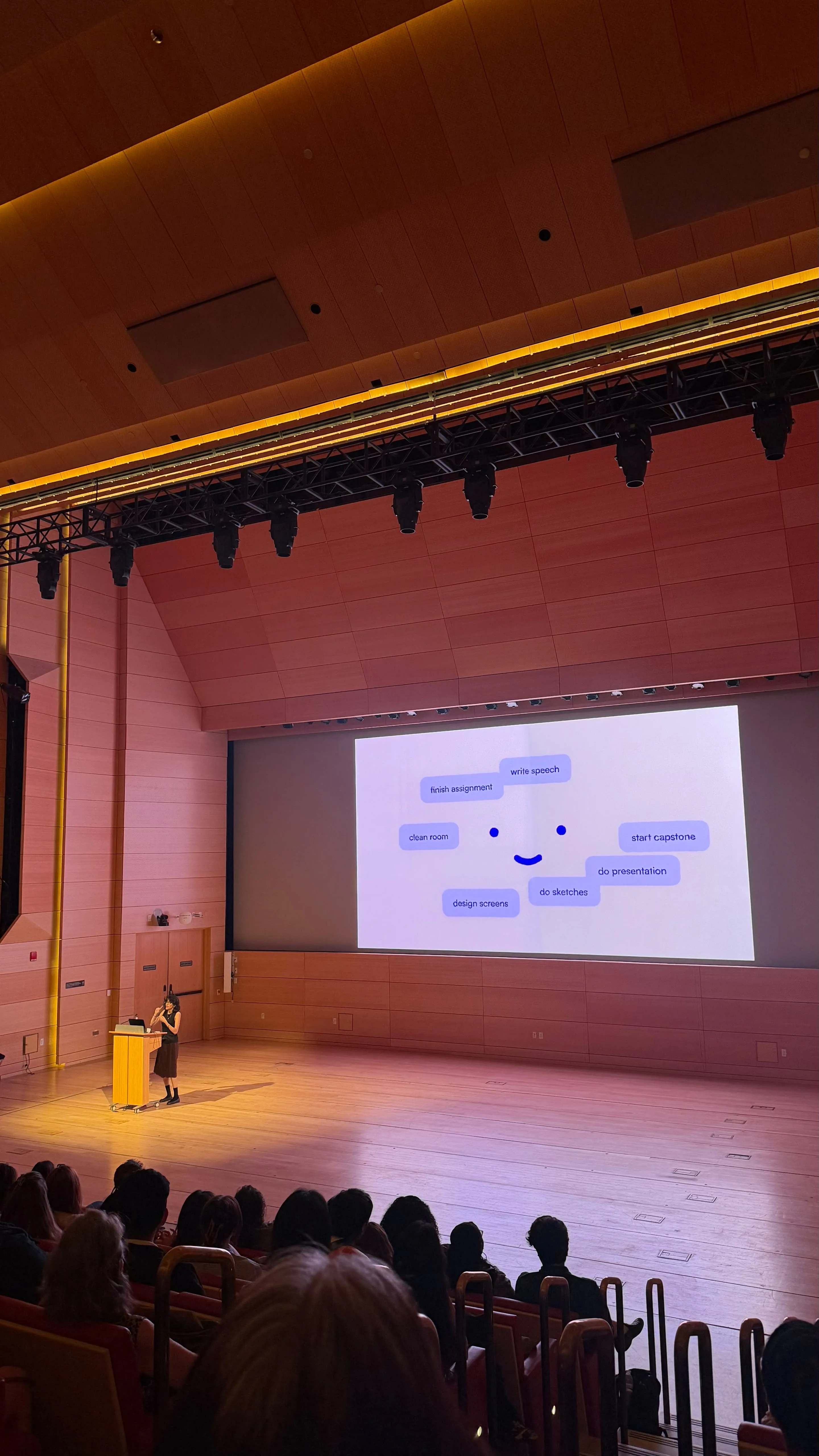
presented at the AIGA grad showcase 2026
worth noting
- larger tasks can also be broken down into sub-tasks and further scheduled via the organized view – these are the yellow dots you see on the calendar.
- tasks that had an inputted deadline appear on the organized view with a red dot on them, so even if they are not as urgent in that current moment, you can always know if it has a pending deadline.
- tasks in dump mode can be deleted by clicking on them to reveal a delete option. they can also be moved around and messed with for fun – as they are ‘floating.’
- tasks that are marked as done are deleted in 10 days.
- tasks are limited to 10 at a time so users can focus on a select number of tasks at once – and the organize mode is more effective at limited capacity.
- the eye on the list view in calendar links to a physical device by the name of Clayton, a small prototype i made that helps users break hyperfocus (a common neurodivergent trait). The longer you spend on a task, the angrier Clayton will get. Hence the ‘eye’, representing a mode I call ‘time-watch.’
Say hi to Clayton.